Chapter 1: Principles of Remote Sensing Systems
Introduction
The principles of remote sensing are based primarily on the properties of the electromagnetic spectrum and the geometry of airborne or satellite platforms relative to their targets. This chapter provides a background on the physics of remote sensing, including discussions of energy sources, electromagnetic spectra, atmospheric effects, interactions with the target or ground surface, spectral reflectance curves, and the geometry of image acquisition.
Definition of Remote Sensing
Remote sensing describes the collection of data about an object, area, or phenomenon from a distance with a device that is not in physical contact with the object. Such data are collected from ground-based, airborne, and satellite platforms that house sensor equipment. The data collected by the sensors are in the form of electromagnetic energy, which is the energy emitted, absorbed, or reflected by objects. Electromagnetic energy is synonymous with many terms, including electromagnetic radiation, radiant energy, energy, and radiation.
Sensors carried by platforms are engineered to detect variations of emitted and reflected electromagnetic radiation. A simple and familiar example of a platform carrying a sensor is a camera mounted on the underside of an airplane. The airplane may be a high or low altitude platform while the camera functions as a sensor collecting data from the ground. The data in this example are reflected electromagnetic energy commonly known as visible light.
Likewise, spaceborne platforms known as satellites, such as Landsat Thematic Mapper (Landsat TM), Satellite Pour l’Observation de la Terra or SPOT, Moderate-Resolution Imaging Spectroradiometer (MODIS), Worldview, and many others carry a variety of sensors. Similar to the above camera example, the sensors on these “passive” systems collect emitted and reflected electromagnetic energy, and are capable of recording radiation from the visible and other portions of the electromagnetic spectrum. Some remote sensing systems are categorized as “active” (e.g., radar and LiDAR) in that they both transmit and receive electromagnetic energy, measuring the reflected radiation returned to the sensor.
Basic Components of Remote Sensing.
The overall process of remote sensing can be broken down into four components:
- Electromagnetic energy is emitted from a source, either natural (most commonly the Sun) or from a manmade system.
- This energy interacts with matter, including the atmosphere and objects on the Earth’s surface.
- Emitted or reflected energy is recorded by a sensor as data.
- Data is displayed digitally for visual and numerical interpretation.
Component 1: Electromagnetic Energy Is Emitted from a Source.
Electromagnetic Energy: Source, Measurement, and Illumination. Remote sensing data become extremely useful when there is a clear understanding of the physical principles that govern what we are observing in the imagery. Many of these physical principles have been known and understood for decades, if not centuries. For this manual, the discussion will be limited to the critical elements that contribute to our understanding of remote sensing principles.
Summary of Electromagnetic Energy. Electromagnetic energy or radiation is derived from the subatomic vibrations of matter and is measured in a quantity known as wavelength. The units of wavelength are traditionally given as micrometers (µm) or nanometers (nm). Electromagnetic energy travels through space at the speed of light and can be absorbed and reflected by objects. To understand electromagnetic energy, it is necessary to discuss the origin of radiation, which is related to the temperature of the matter from which it is emitted.
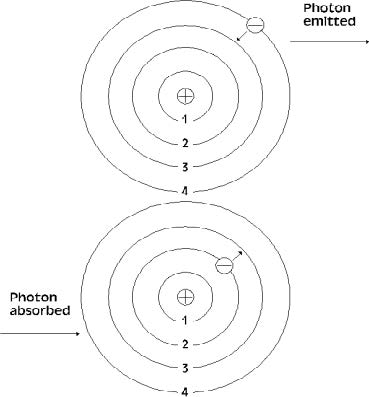
Temperature. The origin of all energy (electromagnetic energy or radiant energy) begins with the vibration of subatomic particles called photons (Figure 1.1). All objects at a temperature above absolute zero vibrate and therefore emit some form of electromagnetic energy. Temperature is a measurement of this vibrational energy emitted from an object. Humans are sensitive to the thermal aspects of temperature; the higher the temperature is the greater is the sensation of heat. A “hot” object emits relatively large amounts of energy. Conversely, a “cold” object emits relatively little energy.
Absolute Temperature Scale.
The lowest possible temperature has been shown to be –273.2°C and is the basis for the absolute temperature scale. The absolute temperature scale, known as Kelvin, is adjusted by assigning –273.2°C to 0 K (“zero Kelvin”; no degree sign). The Kelvin scale has the same temperature intervals as the Celsius scale, so conversion between the two scales is simply a matter of adding or subtracting 273 (Table 1.1). Because all objects with temperatures above, or higher than, zero Kelvin emit electromagnetic radiation, it is possible to collect, measure, and distinguish energy emitted from adjacent objects.
Table 1.1 Different scales used to measure object temperature, conversion formulas are listed below

Nature of Electromagnetic Waves.
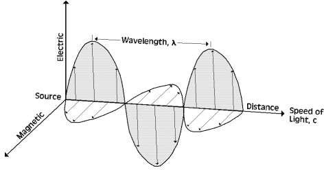
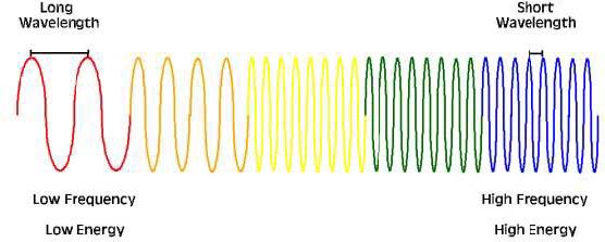
Electromagnetic energy travels along the path of a sinusoidal wave (Figure 1.2) at the speed of light (3.00 × 10⁸ m/s). All emitted and reflected energy travels at this rate, including light. Electromagnetic energy has two components, the electric and magnetic fields. This energy is defined by its wavelength (λ) and frequency (v); see below for units. These fields are in-phase, perpendicular to one another, and oscillate normal to their direction of propagation (Figure 1.2). Familiar forms of radiant energy include X-rays, ultraviolet (UV) rays, visible light, microwaves, and radio waves. All of these waves move and behave similarly; they differ only in radiation intensity.
Measurement of Electromagnetic Wave Radiation.
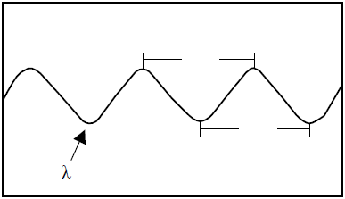
Electromagnetic waves are measured from wave crest to wave crest or conversely from trough to trough. This distance is known as wavelength (λ or “lambda”) and is expressed in units of micrometers (µm) or nanometers (nm) (Figure 1.3 and Figure 1.4).
Frequency.
The rate at which a wave passes a fixed point is known as the wave frequency and is denoted as v (“nu”). The units of measurement for frequency are given as Hertz (Hz), the number of wave cycle Ps per second (Figure 1.4 and Figure 1.5).
Speed of electromagnetic radiation (or speed of light). Wavelength and frequency are inversely related to one another; as one increases the other decreases. Their relationship is expressed as:

This mathematical expression also indicates that wavelength (λ) and frequency (v) are both proportional to the speed of light (c). Because the speed of light is constant, radiation with a relatively short wavelength will have a relatively high frequency; conversely, radiation with a relatively long wavelength will have a relatively low frequency.
Electromagnetic Spectrum.
Electromagnetic radiation wavelengths are typically plotted on a logarithmic scale, in increments of powers of 10, known as the electromagnetic spectrum (Figure 1.6). Though the spectrum is commonly divided into various regions based on certain characteristics of particular wavelengths, it is truly a continuum of increasing wavelengths with no inherent differences among the radiation of varying wavelengths.
For instance, the visible region of the electromagnetic spectrum is commonly classified as the wavelength region spanning approximately 400 to 700 nm (Figure 1.6). This region represents the range of wavelengths within which the human eye can typically detect colors. However, the upper and lower boundaries of this region are somewhat arbitrarily defined, as the precise limits of human vision can vary between individuals.
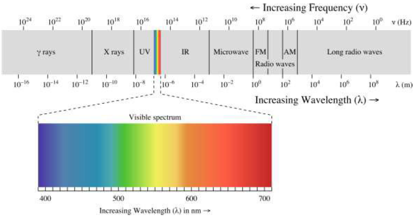
Regions of the Electromagnetic Spectrum. Different regions of the electromagnetic spectrum can provide discrete information about an object. The categories of the electromagnetic spectrum represent groups of measured electromagnetic radiation with similar wavelength and frequency. Remote sensors are engineered to detect specific spectrum wavelength and frequency ranges. Most sensors operate in the visible, infrared (IR), and microwave regions of the spectrum. The following paragraphs discuss prominent regions of the electromagnetic spectrum and their general characteristics and potential uses. The spectrum regions are discussed in order of increasing wavelength and decreasing frequency.
UV. The UV portion of the spectrum contains radiation just beyond the violet portion of the visible wavelengths (Figure 1.6). UV radiation has relatively short wavelengths (10 to 400 nm) and high frequencies. UV wavelengths are used in geologic and atmospheric science applications. Materials, such as rocks and minerals, fluoresce or emit visible light in the presence of UV radiation. The florescence associated with natural hydrocarbon seeps is useful in monitoring oil fields at sea. In the upper atmosphere, UV radiation is greatly absorbed by ozone (O3) and becomes an important tool in tracking changes in the ozone layer.
Visible Light. The radiation detected by human eyes is in the spectrum range aptly named the visible spectrum. Visible radiation or light is the only portion of the spectrum that can be perceived as colors. These wavelengths span a very short portion of the spectrum, ranging from approximately 400 to 700 nm. Because of this short range, the visible portion of the spectrum is often plotted on a linear scale, as in Figure 1.6. This linear scale allows the individual colors in the visible spectrum to be discretely depicted. The shortest visible wavelength is violet and the longest is red. The visible colors and their corresponding wavelengths are listed in Table 1.2.
Visible light detected by sensors depends greatly on the surface reflection characteristics of objects. Urban feature identification, soil/vegetation discrimination, ocean productivity, cloud cover, precipitation, snow, and ice cover are only a few examples of current applications that use the visible range of the electromagnetic spectrum.
Table 1.2 Wavelengths of the primary colors of the visible spectrum

IR. The portion of the electromagnetic spectrum adjacent to the visible range is the IR region (Figure 1.6). This energy is not visible to the human eye but is experienced by humans as the sensation of heat. The IR region ranges from approximately 700 nm to 1 mm, which is more than 100 times as large of a range as that of visible light. The IR region can be subdivided into several sub-regions as outlined in Table 1.3.
Near-IR is the range of wavelengths just beyond (longer than) the red portion of the visible light region. Near-IR and short-wavelength IR (SWIR) wavelengths are also commonly referred to as reflected IR, as measurements of the reflection of these wavelengths (emitted by the Sun) off Earth surfaces can be diagnostic of various properties such as vegetation health and soil composition. The mid- and longer IR wavelengths are categorized as “thermal” IR, as they are emitted from the Earth’s surface in the form of thermal energy and are used to measure temperature variations between various surfaces and objects.
Table 1.3 Common subdivisions of the IR wavelength region

Microwave. Beyond the IR region is the microwave region, including a very broad range of wavelengths from 1 mm to 1 m. Various bands of microwave radiation commonly used in remote sensing applications are listed in Table 1.4. These bands are diagnostic of certain properties of various materials they interact with. Microwave radiation includes the longest wavelengths typically used for remote sensing applications.
Microwave remote sensing is used in the studies of meteorology, hydrology, oceans, geology, agriculture, forestry, and ice, and for topographic mapping. Because microwave emission is influenced by moisture content, it is useful for mapping soil moisture, sea ice, currents, and surface winds. Other applications include snow wetness analysis, profile measurements of atmospheric ozone and water vapor, and detection of oil slicks.
Table 1.4 Wavelengths of various bands in the microwave range

Quantifying Energy. In addition to wavelength and frequency, it is also useful to measure the intensity exhibited by electromagnetic energy. Intensity can be described by Q and is measured in units of Joules (J). The following equation shows the relationship between electromagnetic wavelength, frequency, and intensity:

The equation for energy indicates that, for long wavelengths, the amount of energy will be low, and for short wavelengths, the amount of energy will be high. For instance, blue light is on the short wavelength end of the visible spectrum (446 to 500 nm) while red is on the longer end of this range (620 to 700 nm). Thus, blue light is a higher energy radiation than red light.
Implications for Remote Sensing. The relationship between energy and wave- lengths has implications for remote sensing. For example, in order for a sensor to detect low- energy microwaves (which have a large λ), it will have to remain fixed over a site for a relatively long period of time, known as “dwell time.” Dwell time is critical for the collection of an adequate amount of radiation. Conversely, low energy microwaves can be detected by “viewing” a larger area to obtain a detectable microwave signal. The latter is typically the solution for collecting lower energy microwaves.
Black Body Emission. Energy emitted from an object is a function of its surface temperature. An idealized object called a black body is used to model and approximate the electromagnetic energy emitted by an object. A black body completely absorbs and re-emits all radiation incident to (striking) its surface. A black body emits electromagnetic radiation at all wavelengths if its temperature is above 0 Kelvin. The Wien and Stefan-Boltzmann Laws explain the relationship between temperature, wavelength, frequency, and intensity of energy.
Wien’s Displacement Law. In (Equation 1.2, wavelength is shown to be an inverse function of energy. It is also true that wavelength is inversely related to the temperature of the source. This is explained by Wein’s Displacement Law:


Using this formula, we can determine the temperature of an object by measuring the wavelength of its incoming radiation.
The Stefan-Boltzmann Law. The Stefan-Boltzmann Law states that the total energy radiated by a black body per volume of time is proportional to the fourth power of temperature. This can be represented by the following equation:

This simply means that the total energy emitted from an object rapidly increases with only slight increases in temperature. Therefore, a hotter black body emits more radiation at each wavelength than a cooler one (Figure 1.7).
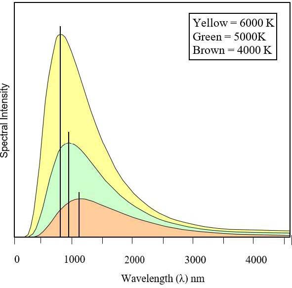
Summary. Together, the Wien and Stefan-Boltzmann Laws are powerful tools. From these equations, temperature and radiant energy can be determined from an object’s emitted radiation. For example, ocean water temperature distribution can be mapped by measuring the emitted radiation, discrete temperatures over a forest canopy can be detected, and surface temperatures of distant solar system objects can be estimated.
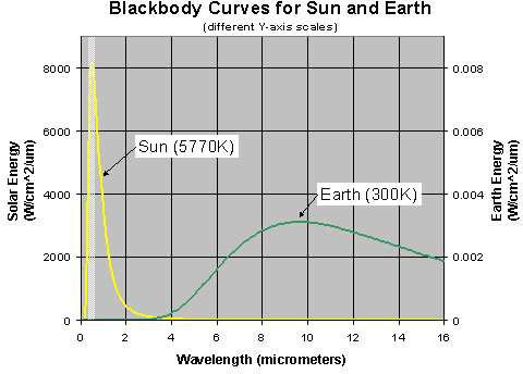
The Sun and Earth as Black Bodies. The Sun’s surface temperature is 5800 K; at that temperature, much of the energy is radiated as visible light (Figure 1.8). We can therefore see much of the spectra emitted from the Sun. Scientists speculate the human eye has evolved to take advantage of the portion of the electromagnetic spectrum most readily available (i.e., sunlight). Note from the figure that the Earth’s emitted radiation peaks between 6 to 16 µm; to “see” these wavelengths, one must use a remote sensing detector.
Passive and Active Sources.
The energy referred to above is classified as passive energy. Passive energy is emitted directly from a natural source. The Sun, rocks, the ocean, and humans are all examples of passive sources. Remote sensing instruments are capable of collecting energy from both passive and active sources.
Active energy is energy generated and transmitted from the sensor itself. Active radar systems transmit their own microwave energy to the surface terrain; the strength of energy returned to the sensor is recorded as representing the surface interaction. Similarly, LiDAR systems (discussed in detail in 0) transmit light to objects in the form of lasers and receive the returned signal to derive distance measurements.
Component 2: Interaction of Electromagnetic Energy with Matter.
Absorption, Transmission, and Reflection. After leaving the source, the emitted energy undergoes a potentially transformative journey on its path to the sensor, changing intensity, wavelength, and direction depending on what materials it encounters along the way. When light encounters other matter, it is absorbed, transmitted, or reflected (Figure 1.9). The intensity and contribution of these effects depend on the wavelength of light, the material in question, and the geometry of the interaction; however, their sum will equal that of the incident energy:

The following discussion will highlight these interactions in the case of passive solar remote sensing, where the Sun is the energy source, and the emitted energy interacts with the Earth’s atmosphere and surface before reaching the sensor.
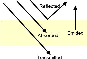
Absorption. With reference to electromagnetic radiation, absorption is the conversion of incident energy into internal energy (most commonly as an increase in temperature) by a material. Absorption is measured as a percentage and is often presented as the opposite of transmission (when referring to the atmosphere) or reflectance (when referring to surface objects) because it is essentially a loss or attenuation of the remote signal. Absorbed energy is incorporated into the chemical bonds of the impacted material, and the bond length, which depends on the chemical makeup of the material, governs which wavelengths are absorbed. Generally, the intensity of the incident energy does not influence absorption.
Transmission occurs when radiation passes through a material. Total absorption (0% transmission) and total transmission (100% transmission) are uncommon as all materials absorb some radiation—this explains why thin or porous media may appear transparent but thicker instances of the same material are opaque.
Atmospheric Windows and Walls.
The gases in the Earth’s atmosphere absorb a significant amount of the Sun’s radiation. Ozone (O3), carbon dioxide (CO2), and water vapor (H2O) are the three main atmospheric compounds that absorb radiation, and each absorbs radiation at particular wavelengths. To a lesser extent, oxygen (O2) and nitrogen dioxide (NO2) also absorb radiation (Figure 1.10).
Wavelength regions of high absorption are called atmospheric walls. Regions of high transmission are called atmospheric windows. Most remote sensing systems are interested in imaging the planet’s surface, so they are constrained to operating in wavelength regions where there are atmospheric windows. Notable elemental absorption regions are discussed below.
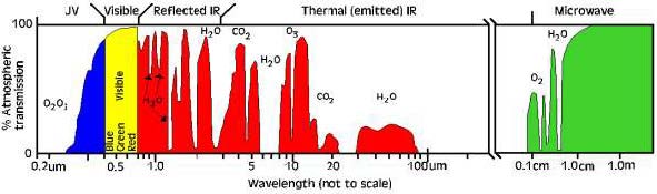
energy sources. Regions of high transmission, atmospheric windows allow radiation to
penetrate the Earth’s atmosphere and reach the surface and sensor. Regions of low
transmission, atmospheric walls are caused by absorption of those wavelengths by gases in the atmosphere; the gases responsible for notable atmospheric walls are indicated by their molecular formula above.
Ozone. Ozone (O3) absorbs harmful UV radiation from the Sun. Without this protective layer in the atmosphere, our skin would burn when exposed to sunlight.
Carbon Dioxide. Carbon dioxide (CO2) is called a greenhouse gas because it greatly absorbs thermal IR radiation. Carbon dioxide thus serves to trap heat in the atmosphere from radiation emitted from both the Sun and the Earth.
Water vapor. Water vapor (H2O) in the atmosphere absorbs incoming longwave IR and shortwave microwave radiation (22 to 1 μm). Water vapor in the lower atmosphere varies annually from location to location. For example, the air mass above a desert would have very little water vapor to absorb energy, while the tropics would have high concentrations of water vapor (i.e., high humidity).
Reflection.
Let us suppose for the moment that any radiation that is not absorbed in the atmosphere reaches the Earth’s surface—this is not quite true, but because it requires some prior discussion of reflection, scattering will be discussed later in this chapter. Upon reaching near- surface objects, radiation can again be transmitted, absorbed, or reflected. Reflection occurs when radiation is neither absorbed nor transmitted but is instead bounced off of the object it encountered. This reflected energy is what is collected by the sensor.
The intensity and wavelength of the reflected energy depends on the material properties, surface roughness relative to the wavelength of the incident light, and geometry. These differences allow us to delineate different materials and objects in remotely sensed imagery. Reflectance is a unitless quantity describing the percentage of incident radiation that is reflected at a particular wavelength:

At each wavelength, a material has a characteristic reflectance, which when taken together form a spectral reflectance curve or spectral signature, which can be used to identify the material. While reflectance is a material property, individual objects reflect light differently based on their surface roughness, their orientation, the orientation of the light source, and the orientation of the sensor. Reflectance describes the ratio of incident to reflected energy for a diffuse or Lambertian surface, orthogonal to the sensor. Deviations from this spatial arrangement result in geometric effects or errors that may need to be corrected for in a remotely sensed product.
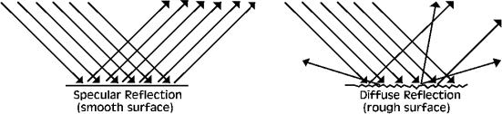
Specular and diffuse reflection. The nature of reflectance is controlled by the wavelength of the radiation relative to the surface texture. Surface texture is defined by the roughness or bumpiness of the surface relative to the wavelength. Objects display a range of reflectance from diffuse to specular. Specular reflectance is a mirror-like reflection, which occurs when an object with a smooth surface reflects in one direction. The incoming radiation will reflect off a surface at the same angle of incidence (Figure 1.11). Diffuse or Lambertian reflectance reflects in all directions from a rough surface. This type of reflectance gives the most information about an object.
Atmospheric Effects.
Up to this point, a simplified view of energy’s path from the Sun, to a ground target, and back to the sensor has been presented in order to establish the basic interactions of light with matter. In this idealized scenario, light that was not absorbed by the atmosphere traveled to the surface and was either absorbed or reflected to the sensor. In actuality, radiation’s journey to the surface involves a plethora of interactions with particles in the atmosphere; however, because the atmospheric constituents are so small, some smaller than the wavelength of the radiation traveling past them, the way that light is transmitted and reflected is somewhat different than with macroscale targets.
The interaction of light with liquids, gases, and small particles is often referred to as scattering and is heavily dependent on the size of the particle or scatterer and the wavelength of the incident radiation
(Table 1.5). Because the composition and density of the atmosphere varies, the path length or the total distance that radiation travels between the top of the atmosphere, the surface, and the sensor, also affects how much scattering occurs. Three prevalent types of scattering that occur in the atmosphere are Rayleigh scattering, Mie scattering, and nonselective or geometric scattering (Figure 1.12).
Table 1.5 Properties of Different Atmospheric Scattering Effects

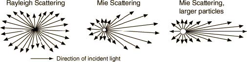
Rayleigh Scattering. Rayleigh scattering dominates when the diameters of atmospheric particles (D) are much smaller than the incoming radiation wavelength (λ). This leads to a greater amount of short wavelength scatter resulting from the small particle size of atmospheric gases. Scattering is inversely proportional to wavelength by the fourth power:

This means that shorter wavelengths (those shorter than about 10% of the scatterer’s diameter) will be diffusely scattered, or transmitted equally in all directions (Figure 1.12). Longer wavelengths are unaffected and will be transmitted without changing direction. Rayleigh scattering is an elastic scattering process, meaning the wavelength of the scattered light is unchanged, merely separated from the incident spectra (Figure 1.13).
Why is the sky blue? Rayleigh scattering accounts for the Earth’s blue sky (Figure 1.13). We see predominately blue because the wavelengths in the blue region (0.446–0.500 μm) are scattered primarily by nitrogen gas (N2, D = 3.6 x 10⁻¹⁰ m) in the atmosphere. When radiation from the Sun encounters nitrogen molecules, notably those that are not necessarily in the path between the Sun and our eyes, most of the wavelengths are transmitted to the surface or to space, depending on the angle; however, short wavelengths are scattered diffusely, in all directions. Some of that blue light, effectively amplified by the sheer number of interactions, reaches our eyes and makes the sky appear blue.
Our perception of sunrise and sunset as red or pink is caused by the same phenomenon. When the Sun is lower in the sky, light must travel through a greater thickness of atmosphere to reach our eyes (Figure 1.13). This increase in path length increases the number of interactions light has with molecules in the atmosphere and increasingly longer wavelengths are scattered as the incident signal is depleted, leaving only reddish wavelengths to reach the eye. Another example of this effect is “Earthrise” on the Moon as famously captured by the Apollo 8 mission. The Moon has no atmosphere, and therefore, no Rayleigh scattering, so no sunlight is reflected back to the observer. This explains why the Moon’s sky appears black (shadows on the Moon are more black than shadows on the Earth for the same reason; see Figure 1.14).

Mie Scattering. Mie scattering occurs when an atmospheric particle diameter is on the order of the radiation’s wavelength (D ≈ λ), most commonly in the presence of water vapor, dust, smoke, or smog. Mie scattering is both gradational and directional—there is more scattering from larger particles and the intensity of the scattering is in the same direction as the incident radiation. For example, the bright white halo we observe around the Sun is from Mie scattering of water vapor in the atmosphere. Similarly, water droplets (larger diameters than vapor) in clouds appear white because of Mie scattering.
Nonselective Scattering. At even larger particle sizes (5–100 μm), Mie scattering approaches the point where all wavelengths are scattered equally or nonselectively. This leads to the scatter of visible, near IR, and mid-IR. All these wavelengths are equally scattered. This scattering effect is noticeable in haze, smog, and clouds (those with large droplet sizes prior to precipitation events).
Summary. You now have an understanding of where remotely sensed energy comes from, its composition, and what effects the materials it encounters can have on it as it travels from its source, to a target, and back to the sensor. The next section will highlight what information a typical remote sensor actually collects and begin the discussion of how to extract information about the target or surface from the collected data.
Component 3 & 4: Energy Is Detected and Recorded by the Sensor.
Earlier sections of this chapter explored the nature of emitted and reflected energy and the interactions that influence the resultant radiation as it traverses from source to target to sensor. This section will address how data is collected by a sensor, the transition of remotely sensed data to a usable product, including an introduction to correcting for radiometric, atmospheric, and geometric effects.
Conversion of the Radiation to Data. Data collected at a sensor are converted from a continuous analog to a digital number (DN). This is a necessary conversion, as electromagnetic waves arrive at the sensor as a continuous stream of radiation. The power of the incoming radiation is sampled at regular time intervals by measuring the voltage created at the sensor. This voltage is converted to a DN, most often as an 8, 16, or 32-bit integer. Table 1.6 contains a list of select bit integer binary scales and their corresponding number of brightness levels. The ranges are derived by exponentially raising the base of 2 by the number of bits.
Table 1.6 DN value ranges for various unsigned integer types

Diversion on Data Type. DN values for raw remote sensing data are usually integers. Occasionally, data can be expressed as a decimal. The most popular code for representing real numbers (a number that contains a fraction, such as 0.5, which is one-half) is called the Institute of Electrical and Electronics Engineers or IEEE, pronounced I-triple-E, Floating-Point Standard. ASCII text or American Standard Code for Information Interchange text, pronounced ask-ee, is another alternative computing value system. This system is used for text data.
You may need to be aware of the type of data used in an image, particularly when determining the DN in a pixel. For most sensors, the data numbers recorded are not indicative of physical properties and need to be rescaled or calibrated to spectral radiance or spectral reflectance. This process is called radiometric calibration and varies by sensor; specific instructions for converting data numbers to radiance or reflectance can be found in the documentation for individual sensing systems.
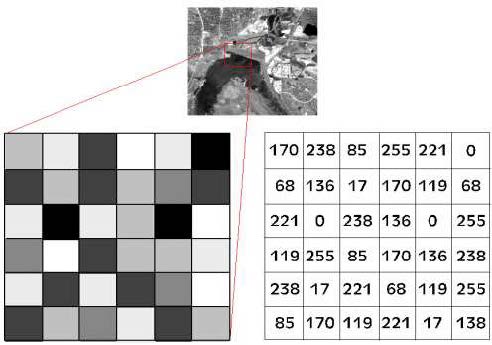
Turning Digital Data into Images. Satellite data can be displayed as an image on a computer monitor by an array of pixels, or picture elements, containing DNs. The composition of the image is simply a grid of continuous pixels, known as a raster image (Figure 1.15). The DN of a pixel is the result of the spatial, spectral, and radiometric averaging of reflected/emitted radiation from a given area of ground cover. The DN of a pixel is therefore the average radiance of the surface area the pixel represents, and the value given to the DN is based on the brightness value of the radiation.
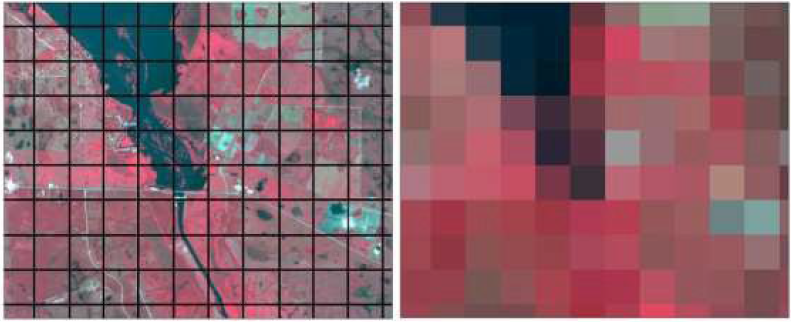
For most radiation, an 8-bit scale is used that corresponds to a value range of 0–255 (Table 1.6). This means that 256 levels of brightness (DN values are sometimes referred to as brightness values—Bv) can be displayed, each representing the intensity of the reflected/emitted radiation.
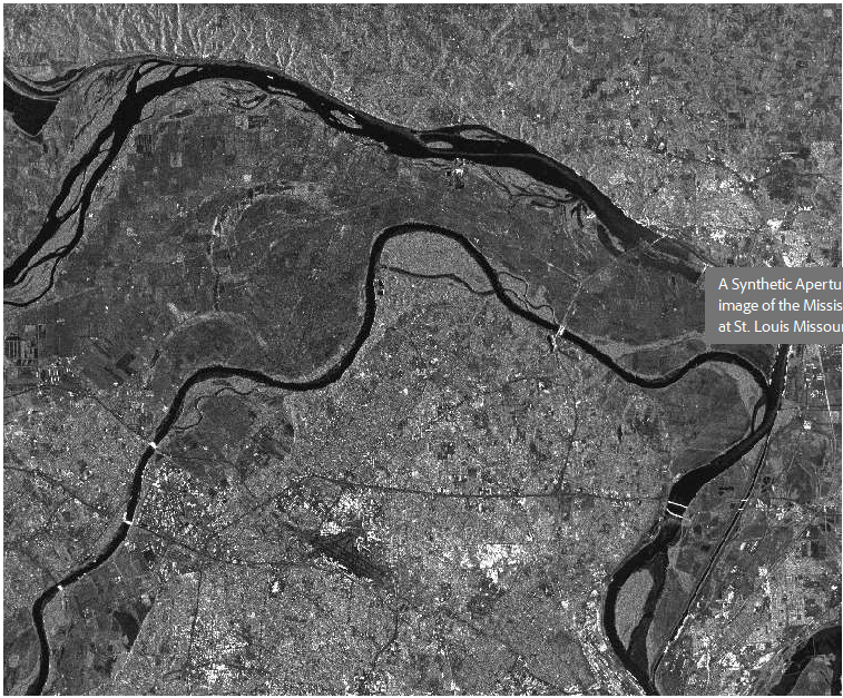
On the image this translates to varying shades of grays. A pixel with a brightness value of zero (Bv = 0) will appear black; a pixel with a Bv of 255 will appear white (Figure 1.16). All brightness values in the range of Bv = 1 to 254 will appear as increasingly brighter shades of gray. In Figure 1.16, the dark regions represent water-dominated pixels, which have low reflectance/Bv, while the bright areas are developed land (agricultural and forested), which has high reflectance.
Spectral Radiance. As reflected energy radiates away from an object, it moves in a hemi-spherical path. The sensor measures only a small portion of the reflected radiation—the portion along the path between the object and the sensor. This measured radiance is known as the spectral radiance (Equation 1.8).

The steradian is the international unit of solid angle, the three-dimensional equivalent to the radian. The energy sampled by the sensor across this angle corresponds to a single pixel in the output. Spectral reflectance can be calculated from spectral radiance by normalizing the radiance measurement with the power of the incident radiation. During this process, geometric and atmospheric affects may need to be accounted for.
Atmospheric Correction Techniques. Data can be corrected by resampling with the use of image processing software such as ERDAS Imagine or ENVI, or by the use of specialty software. In many of the image processing software packages, atmospheric correction models are included as a component of an import process. Also, data may have some corrections applied by the vendor. When acquiring data, it is important to be aware of any corrections that may have been applied to the data. Correction models can be mathematically or empirically derived.
Empirical Modeling Corrections. Measured or empirical data collected on the ground at the time the sensor passes overhead allows for a comparison between ground spectral reflectance measurements and sensor radiation reflectance measurements. Typical data collection includes spectral measurements of selected objects within a scene as well as a sampling of the atmospheric properties that prevailed during sensor acquisition. The empirical data are then compared with image data to interpolate an appropriate correction.
Empirical corrections have many limitations, including cost, spectral equipment availability, site accessibility, and advanced preparation. It is critical to time the field spectral data collection to coincide with the same day and time that the satellite collects radiation data. This requires knowledge of the satellite’s path and revisit schedule. For archived data, it is impossible to collect the field spectral measurements needed for developing an empirical model that will correct atmospheric error. In such a case, a mathematical model using an estimate of the field parameters must complete the correction.
Mathematical Modeling Corrections. Alternatively, corrections that are mathematically derived rely on estimated atmospheric parameters from the scene. These parameters include visibility, humidity, and the percent and type of aerosols present in the atmosphere. Data values or ratios are used to determine the atmospheric parameters. Subsequently, a mathematical model is extracted and applied to the data for re-sampling.
Spectral Reflectance Curves.
A surface feature’s color can be characterized by its reflectance, the percentage of incoming electromagnetic energy (illumination) it reflects at each wavelength across the electromagnetic spectrum. This is its spectral reflectance curve or spectral signature, and as above, it is an unchanging property of the material. For example, an object such as a leaf may reflect 3% of incoming blue light, 10% of green light, and 3% of red light. The amount of light it reflects depends on the amount and wavelength of incoming illumination, but the percentages are constant.
Unfortunately, remote sensing instruments do not record reflectance directly, rather radiance, which is the amount (not the percent) of electromagnetic energy received in selected wavelength bands. A change in illumination, more or less intense Sun for instance, will change the radiance. Spectral signatures are often represented as plots or graphs, with wavelength on the horizontal axis and the reflectance on the vertical axis (Figure 1.17 provides a spectral signature for snow).
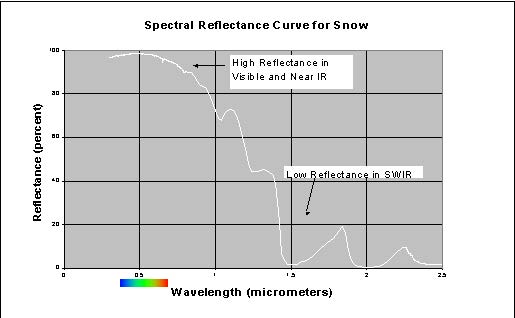
Important Reflectance Curves and Critical Spectral Regions. While there are too many surface types to memorize all their spectral signatures, it is helpful to be familiar with the basic spectral characteristics of green vegetation, soil, and water. This in turn helps determine which regions of the spectrum are most important for distinguishing these surface types.
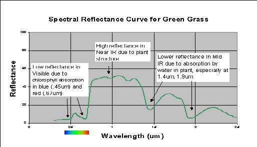
Spectral Reflectance of Green Vegetation. Reflectance of green vegetation (Figure 1.18) is low in the visible portion of the spectrum because of chlorophyll absorption, high in the near IR due to the cell structure of the plant, and lower again in the shortwave IR due to water in the cells. Within the visible portion of the spectrum, there is a local reflectance peak in the green (0.55 µm) between the blue (0.45 µm) and red (0.68µm) chlorophyll absorption valleys.
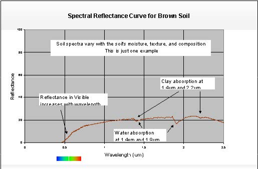
Spectral Reflectance of Soil. Soil reflectance (Figure 1.19) typically increases with wavelength in the visible portion of the spectrum and then stays relatively constant in the near-IR and shortwave IR, with some local dips resulting from water absorption at 1.4 and 1.9 µm and resulting from clay absorption at 1.4 and 2.2 µm.
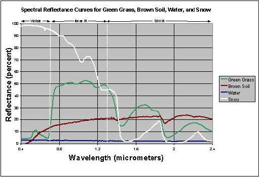
Spectral Reflectance of Water. Spectral reflectance of clear water is low in all portions of the spectrum (Figure 1.20). Reflectance increases in the visible portion when materials are suspended in water.
Critical Spectral Regions. The spectral regions that will be most useful in a remote sensing application depend on the spectral signatures of the surface features to be distinguished. Figure 1.20 shows that the visible blue region is not very useful for separating vegetation, soil, and water surface types, since all three have similar reflectance, but visible red wavelengths separate soil and vegetation. In the near IR (0.7 to 2.5 µm), all three types are distinct, with vegetation high, soil intermediate, and water low in reflectance. In the shortwave IR, water is distinctly low, while vegetation and soil exchange positions across the spectral region.
When spectral signatures cross, the spectral regions on either side of the intersection are especially useful. For instance, green vegetation and soil signatures cross at about 0.7 µm, so the 0.6 µm (visible red) and 0.8-µm and larger wavelengths (near IR) regions are of particular interest in separating these types. In general, vegetation studies include near IR and visible red data, water vs. land distinction include near IR or shortwave IR. Water quality studies might include the visible portion of the spectrum to detect suspended materials.
Spectral Libraries. As noted above, detailed spectral signatures of known materials are useful in determining whether and in what spectral regions surface features are distinct. Spectral reflectance curves for many materials (especially minerals) are available in existing reference archives (spectral libraries). Data in spectral libraries are gathered under controlled conditions, quality checked, and documented. Since these are reflectance curves, and reflectance is theoretically an unvarying property of a material, the spectra in the spectral libraries should match those of the same materials at other times or places.
Two major spectral libraries that are freely available online are:
- USGS Spectral Library (Kokaly et al., 2017): https://www.usgs.gov/labs/spec-lab
- ECOSTRESS Spectral Library (formerly the ASTER Spectral Library) (Baldridge et al., 2009; Meerdink et al., 2019): http://speclib.jpl.nasa.gov/
The ECOSTRESS Spectral Library includes data from three other spectral libraries: Johns Hopkins University, the Jet Propulsion Laboratory, and the USGS.
Brief History of Remote Sensing.
Remote sensing technologies have been built upon by the work of researchers from a variety of disciplines. One must look further than 100 years ago to understand the foundations of this technology; however, the foundations of remote sensing as we use it today started to be developed in the 1960s and have progressed rapidly since then. This advancement has been driven by both the military and commercial sectors in an effort to effectively model and monitor Earth processes.
The Camera.
The concept of imaging the Earth’s surface has its roots in the development of the camera. While some of the important concepts behind photography were realized as early as 1021 AD, the first camera to assume a recognizable form and produce images on film was developed in 1816. A small aperture allows light reflected from objects to travel into the black box. The light then “exposes” film, positioned in the interior, by activating a chemical emulsion on the film surface.
After exposure, the film negative (bright and dark are reversed) can be used to produce a positive print or a visual image of a scene. Since then, photography has advanced significantly, and film cameras have, for the most part, been replaced by digital cameras, which create raster images using 3-band sensors, similar to those housed in satellites. This transition illustrates an important linguistic distinction—a photograph is an image created by a film camera, whereas an image is a pixel representation of a scene.
Aerial Photography.
The idea of mounting a camera on platforms above the ground for a “bird’s-eye view” came about in the mid-1800s. In the 1800s, there were few objects that flew or hovered above ground. During the United States (U.S.) Civil War, cameras where mounted on balloons to survey battlefield sites. Later, pigeons carrying cameras were employed. The use of balloons and other platforms created geometric problems that were eventually solved by the development of a gyro-stabilized camera mounted on a rocket. This gyro-stabilizer was created by the German scientist Maul and was launched in 1912. Today, aerial platforms continue to be valuable to the remote sensing community because of their high resolution and targeted nature.
First Satellites.
The world’s first artificial satellite, Sputnik 1, was launched on 4 October 1957 by the Soviet Union. It was not until NASA’s meteorological satellite, Television IR Operational Satellite (TIROS)-1 was launched in 1960 that the first satellite images were produced. NASA’s first satellite missions involved study of the Earth’s weather patterns. TIROS missions launched 10 experimental satellites in the early 1960s in an effort to prepare for a permanent weather bureau satellite system referred to as TOS which stands for TIROS Operating System.
Subsequent programs including TIROS-N, Advanced TIROS-N, and the National Oceanic and Atmospheric Administration’s D system extended the data record of these early weather satellites through the turn of the century. The first satellite imagery program was the classified CORONA Program, which collected imagery between 1959 and 1972. CORONA was developed as a replacement for the U-2 Aerial Photography Program to reduce the risk of flying into remote regions of foreign airspace. Imagery from CORONA had 40 m resolution and was declassified in 1995.
Landsat Program.
The 1970s brought the introduction of the Landsat series of satellites with the launching of Earth Resources Technology Satellite (also known as Landsat 1) by NASA. The Landsat program was the first attempt to image whole Earth resources, including terrestrial (land-based) and marine resources. Images from the Landsat series allowed for detailed mapping of land- masses on a regional and continental scale. Landsat imagery continues to provide a wide variety of information that is highly useful for identifying and monitoring resources, such as fresh water, timberland, and minerals.
Landsat imagery is also used to assess hazards such as floods, droughts, forest fires, and pollution. Geographers have used Landsat images to map previously unknown mountain ranges in Antarctica and to map changes in coastlines in remote areas. A notable event in the history of the Landsat program was the addition of the Thematic Mapper on Landsat 4 in 1982. The Thematic Mapper produced 30-meter resolution imagery—a major improvement over the 70-meter imagery available at the time.
More importantly, the Thematic Mapper was the first 30-meter sensor in a series of sensors carried on Landsat missions (later versions were the Enhanced Thematic Mapper Plus and the Operational Land Imager), which have maintained a global, 30-meter imagery data set ever since. This data set is currently maintained by the USGS Earth Resources Observation and Science Data Center and is freely available at http://earthexplorer.usgs.gov.
MODIS is a sensor housed on two NASA satellites: Aqua and Terra. MODIS is notable because it images the entire planet every day and its data is freely available from NASA’s Disturbed Active Archive Centers, searchable at http://reverb.echo.nasa.gov/reverb. Because of its global scale and high temporal resolution, MODIS has been used to monitor global processes (at 250 to 500 m resolution) since its launch in 2000, and a vast array of products ranging from sea surface temperature to snow covered area have been developed from its 36 spectral bands. At the time of writing, MODIS is past its design life but its successor has already been launched.
The Visible IR Imaging Radiometer Suite was launched on board the Suomi National Polar-orbiting Partnership satellite in November 2011 and aims to continue the global record established by MODIS.
High Resolution Optical Systems. Advances in commercial satellite imagery have created a huge surge in both the supply and demand of high-resolution multispectral satellite imagery in the last decade. The transition to high resolution commercial systems began with the launches of IKONOS and Quickbird in 1999 and 2001, respectively. These satellites boast resolutions on the order of meters rather than tens of meters and have become finer as time goes on. Worldview 3, which was launched in August 2014, collects multispectral imagery at just over 1 m resolution. Capabilities of individual systems can be found on their vendor’s websites. DigitalGlobe, the developer of the Worldview series of satellites, is perhaps the most widely known and contracted image vendor: https://www.digitalglobe.com.
Non-Optical Sensing Systems. We have concentrated on optical and multispectral imagers, but many remote sensing systems do not rely on the Sun as the radiation source. There are a variety of active remote sensing systems (e.g., RADAR and LiDAR) that transmit and receive their own signals and have a wide range of applications and platforms associated with them.
Future of Remote Sensing.
The improved availability of satellite images coupled with the ease of image processing has led to numerous and creative applications. Remote sensing has dramatically brought about changes in the methodology associated with studying Earth processes on both regional and global scales. Advancements in sensor resolution, particularly spatial, spectral, and temporal resolution broaden the possible applications of satellite data. Both government agencies around the world and private companies are pushing to meet the demand for reliable and continuous satellite coverage. This includes both technological advances in large satellite systems, like the Worldview series and the development of small or micro-satellites. Planet Labs, NASA, and others are working to develop constellations of small satellites that are able to image the planet daily at high resolution and low cost.
Chapter 2: Three-Dimensional (3D) Data Acquisition
Light Detection and Ranging Systems.
Current State of the Art. The text below is an attempt to give a general overview of the significant components that make up an airborne laser scanning system, but is by no means an exhaustive description, and is based upon the work presented in Glennie et al., 2013. The interested reader is encouraged to refer to some recent sources on airborne laser scanning including [Renslow 2012, Shan and Toth 2009, Vosselmann and Mass 2010, Maune and Nayegandhi 2019].
Time-of-flight ranging.
All current airborne laser scanning systems are based upon time-of-flight laser ranging, where the ranging unit consists of a laser transmitter that emits short pulses of laser light, and an optical receiver that detects backscattered laser radiation. With precise electronics, the round- trip travel time of the light can be measured and directly converted to range: ∆t = 2R/c, where ∆t is the round-trip flight time of the laser, R is the range (distance) between emitter/receiver and target, and c is the speed of light in the atmosphere.
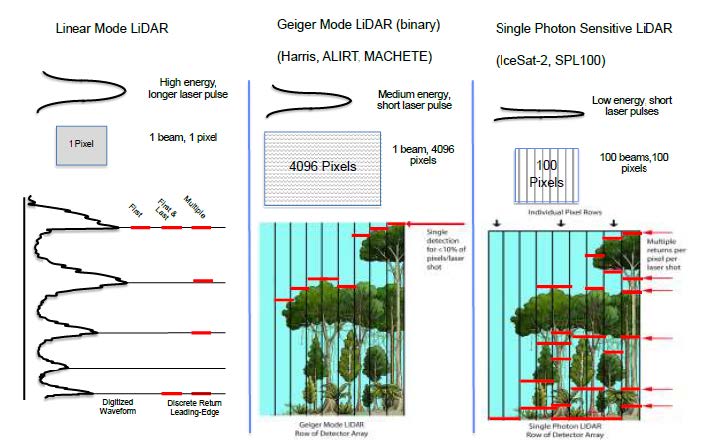
Once the laser pulse is emitted from the transmitter, its propagation and reflection are governed by the same phenomena discussed in Chapter 1 for visible light sources. Current commercial LiDAR systems almost exclusively use avalanche photodiodes (APD) as their photodetector. The APD converts the incident photon energy into a proportional analog electric current. For so-called discrete return airborne LIDAR systems, the analog signal is then analyzed in real time to extract the peaks from the incident laser light waveform.
Full waveform ranging.
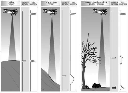
For simple discrete return systems, as described above, the real-time analysis of the returned energy simply identifies the peak power locations of the return signal, which normally correspond to the hard targets illuminated by the laser. However, recent technological advancements allow the recording of the entire echo of the backscattered illumination at significantly higher sampling rates (1 to 2 GHz), resulting in a sampled waveform of the entire backscattered illumination (i.e., full waveform LiDAR or (FWL)) (Figure 2.1).
FWL provides a new ability to enhance pulse peak detection through post-processing, and further quantify additional information about the imaged scene by parametric and volumetric analysis of the sampled backscattered illumination. While the acquisition of FWL return information can provide additional information, it should also be noted that the processing time required to convert these waveform signatures into usable information is currently quite time prohibitive.
Single photon sensitivity.
Traditional discrete return and FWL systems rely on the return light energy having a high signal-to-noise ratio so that the detector is easily able to measure a proportion of the number of returning light photons—typically thousands of photons are required. This is not the most efficient use of the light energy, and as a result, the power required to run the lasers is high and the standoff distance for collection is relatively limited.
However, recent developments have brought new LiDAR systems that employ sensitive light detection technologies and fast-timing electronics. These systems are based upon low energy, short pulse lasers, and sensitive photon-counting detector arrays, which are able to measure very low levels of reflected active radiation—often down to the level of a single photon. These single photon systems are able to collect observations from higher elevations, and therefore are efficient at capturing large swaths of data in a limited amount of time.
This efficiency does come at a cost, however. Because the detectors being used are extremely sensitive, they are also significantly noisier and subject to false returns from scattered light from the Sun, for example. Therefore, the resultant range observations from a single photon-sensitive system requires additional denoising steps to extract target returns from background noise. Currently, there are two competing modes for single photon systems: (a) Geiger mode detectors, and (b) single photon-sensitive systems.
Geiger mode systems use detectors that operate as a binary detection system; either they sense light return or they don’t. These detectors therefore do not directly provide intensity of the return signal. These detectors also generally have longer reset times, meaning that only one return is detected per outgoing pulse. As a result, they also tend to require areas with complex structure (e.g., vegetation) to be sampled multiple times in order to increase the probability of detecting both the tree canopy and the ground beneath it.
To enable oversampling, multiple detectors in an array (like a digital camera) are used to detect returns. A large outgoing laser beam footprint is used to illuminate the field of view of the detector array, and each individual pixel in the array measures an independent range to the targets of interest (Figure 2.2). Geiger mode systems are used commercially by Harris Corporation, and have been used in the DoD-developed systems Airborne Ladar Imaging Research Testbed and MACHETE.
Single photon-sensitive systems do not operate as a binary detector, but rather use devices (either photomultiplier tubes or silicon photomultipliers) that are sensitive down to the level of a few photons. The primary difference between these systems and Geiger mode sensors is that photomultipliers do not have long reset times, and are therefore able to generate multiple returns per outgoing laser pulse. As a result, their requirements for oversampling in complex structure is not as high, and current systems use a smaller array of detectors than that of Geiger Mode systems. The Leica SPL100 and the Advanced Topographic Laser Altimeter System (ATLAS) system on the IceSat-2 satellite are examples of single photon- sensitive ranging devices.
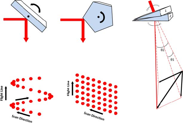
Scanning systems. The collection of a three-dimensional surface requires that the LiDAR system has a mechanism to steer the single laser beam in two dimensions across the surface of the object. For an airborne system, one direction of scanning motion is provided by the forward motion of the aircraft. The second dimension must be accomplished using a mechanical motion, which is usually implemented by the use of a scanning mirror. There are a number of possibilities for scanning mirrors, but the most common for airborne LiDAR systems are the oscillating mirror, the rotating polygon, and the risley prism, which are graphically depicted in Figure 2.3.
Enabling technology [Global Navigation Satellite Systems/Inertial Navigation Systems (GNSS/INS)].
For kinematic LiDAR, the laser scanning mechanism is continually moving during data acquisition; therefore, to render a 3D point cloud from the LiDAR observations, the global position and orientation (attitude) of the laser scanning system must be known at all times (6 degrees of freedom). The process of estimating the position and attitude of a remote sensing platform is commonly referred to as direct georeferencing and is enabled through a combination of GNSS/INS, and Inertial Measurement Unit (IMU) technology.
An IMU consisting of three orthogonal accelerometers and three orthogonal gyroscopes, when coupled with high rate (1 Hz or greater) GNSS/INS, is capable of providing full estimates of 6 degrees of freedom motion at data rates of 100 to 2000Hz. This data rate is still significantly lower than that of the laser scanner (0.1 to 1.0 MHz), and therefore the trajectory must be interpolated to determine airframe position and attitude for every emitted laser pulse.
Typical aircraft dynamic motion has a frequency of 6 to 10 Hz, and as a result, simple linear or spline interpolation of the trajectory is normally sufficient.
Bathymetric LiDAR.
A majority of commercially available LiDAR systems use near IR laser sources. While these lasers provide excellent observations over terrain, vegetation, snow, and ice, they are not able to penetrate water. As a result, bathymetric LiDAR systems are specialized sensors that use lasers in the visible spectrum that are capable of penetrating shallow water. The most common wavelength for bathymetric LiDAR is 532 nm, which is in the green portion of the visible spectrum. Green lasers are able to penetrate water to provide benthic layer mapping and subsurface obstacle detection.
Because the green laser used for bathymetry is still a light source, the depth that it can measure is highly dependent upon the clarity of the water being observed. There are a number of methods to describe water clarity (or turbidity), with the most common being Kd, the diffuse attenuation coefficient of the water. Most bathymetric systems are able to measure to a depth of 2 to 3 Kd. In even the most clear water, however, maximum depths are generally limited to 50 to 60 meters because of power absorption and scattering from the water column.
The processing and point cloud acquisition from bathymetric LiDAR systems are significantly more complex than that of topographic systems. This is because the LiDAR pulse is both refracted and slowed down by travel through the water. As a result, bathymetric processing requires determination of the air-water interface so that the return pulses can be corrected for the change in the speed of light and the bending of the laser beam at the water surface. Because of this more complex geometry, full waveform systems are often utilized to enable more accurate bathymetric determination.
Data acquisition discussion. There are a number of ways to classify topographic LiDAR observations. One of the more useful methods of dichotomy involves a classification according to the data collection platform.
Static Terrestrial. Static terrestrial observations are collected from a stationary laser scanner, typically mounted rigidly to a surveying tripod. This type of acquisition is generally referred to as terrestrial laser scanning (TLS). Because the laser scanner does not move during acquisition, an additional mechanical rotation must be added to the scanner to allow for a full 3D point cloud acquisition. The data collected from a TLS platform has very high resolution with higher accuracy because a GNSS/INS is not required to determine location. However, because the line of sight of the instrument is from the ground, it is normally limited to shorter distances as occlusions in the field of view normally limit long-range observations except barren environments.
Airborne. Airborne scanning affixes the laser scanner and accessories (e.g., GNSS/INS) to either a fixed wing aircraft or a helicopter platform with the instrument normally scanning in a nadir direction. Data is normally collected in a “lawnmower-like pattern”. The field of view of the instrument is normally 40 to 80 degrees, and adjacent flight lines are normally overlapped by at least 30 to 50% to accommodate variations in aircraft trajectory and to provide multiple observations of the same topography. Note that for the purposes of acquisition, the use of an unmanned aerial vehicle is also considered an airborne collection (Table 2.1).
Table 2.1 Typical flight characteristics and point density. Both linear and single photon systems

Mobile.
- The principles behind mobile laser scanning (MLS) are in practice very similar to that of an airborne system. The acquisition platform (e.g., passenger vehicle, boat) is still assumed to be moving, as in the case of airborne acquisitions, the laser scanner must be rigidly mounted with a high-precision GNSS/INS system for determining laser system position and orientation during acquisition. In general, MLS is used predominantly for corridor projects (e.g., highways and railways), where airborne collection would not be cost effective.
- MLS is also required where the primary features of interest are vertical objects that cannot be efficiently scanned from an airborne nadir-looking platform. Examples would be building facades and infrastructure in urban environments. Because of the normally limited range of MLS systems, point densities can be as high as thousands of points per square meter, especially near the acquisition platform.
- There are a couple of unique challenges with MLS. First, because the objects of interest tend to be all around the platform, a laser scanner with a large field of view (usually 360 degrees) is often required. Secondly, because collection usually occurs in areas that cause occlusions for GNSS/INS positioning (such as under tree canopy, in tunnels, or in urban environments), the determination of an accurate vehicle trajectory is a significant challenge with MLS processing.
Space-Based. Space-based LiDAR observations provide their own set of technical challenges. Ranging distance for space-based LiDAR is >100 km, and therefore, fairly powerful lasers and low signal detectors are required for observations. Currently, there are two spaced- based LiDAR missions being supported. The first is the ATLAS sensor on the IceSat-2 satellite, and the second is the Global Ecosystem Dynamics Investigation (GEDI) sensor that is attached to the International Space Station. Details on instrument specifications and mission objectives are briefly summarized below. Currently, these space-based systems are only used for collecting profiles.
- The GEDI laser provides laser ranging profile observations of the Earth’s forests and topography. The primary goal of the mission is to provide global vegetation heights to advance understanding of carbon and water cycle processes, biodiversity, and habitat. GEDI was commissioned on the International Space Station on March 25, 2019, and has a planned 2-year mission duration.
- GEDI contains three lasers at 1064 nm, which produce 8 profile beams spaced ~600
meters apart. Each laser pulses 242 times a second, collecting a point every 60 m on the ground track with an approximate footprint diameter of 25 m. The GEDI sensor is a linear mode system, and full waveform records are recorded for each of the profile beams. See https://gedi.umd.edu/ for more details. - ATLAS is the primary instrument onboard ICESat-2 (Ice, Cloud, and Land Elevation Satellite-2). The primary goal of the ICESat-2 mission is to measure the height of a changing Earth, with a particular focus on changes in the cryosphere in a warming climate. ICESat-2 was launched in September 2018 and has a design operational life of 3 years.
- ATLAS contains a single laser (plus a spare) at 532 nm, which produces 6 laser profiles (in three pairs). The pairs are separated by ~3 km, and the beams in each pair are 90 m apart. The laser pulse rate is 10 kHz, and results in a sample every 0.7 m along track with a footprint size of 13 m. The profile is highly oversampled because ATLAS uses a single photon-sensitive detector and therefore the dense samples are needed to overcome noise. See Neumann et al., 2019 for more details on IceSat-2. Note that since IceSat-2 uses a green laser, it is also capable of producing shallow water bathymetric estimates.
Representative LiDAR Products.
The point cloud produced by a LiDAR system includes returns from all objects within the field of view of the laser scanner. The resultant point cloud does not have any point identification (or classification) assigned to each individual point. As a result, automated and manual filtering routines are usually applied in software in order to estimate the type of surface that the laser point was returned from. In a majority of applications, the most basic filtering process separates the LiDAR point cloud into ground and non-ground features.
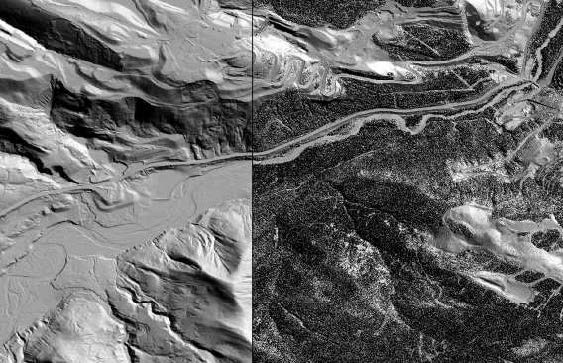
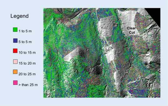
The separation of the dataset into ground and non-ground returns allows the generation of digital terrain models (DTMs) of the ground surface, and digital elevation models (DEMs) of the so-called unclassified datasets. An example of a DTM and DEM, displayed as a hillshade model is shown in Figure 2.4. The difference between the DTM and DEM surface is also commonly delivered as a point cloud product to display object height above ground. As an example, a model of tree height calculated as the difference between surfaces is given in Figure 2.5.
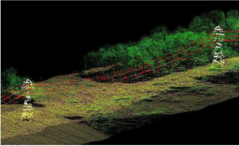
Some applications of LiDAR point clouds can require additional classification beyond the simple separation into ground and non-ground returns displayed in Figures 2.4 and 2.5. In these specialized instances, additional classification can be applied to the non-ground points to extract additional features such as the transmission line and towers as illustrated in Figure 2.6.
Finally, in addition to location data, most modern LiDAR scanning systems also record a measure of the relative backscatter of the backscattered laser illumination from the target. This quantity is normally referred to as the laser intensity. In general, the scale and resolution of these intensity measurements varies between LiDAR scanners, but for a single scan, the variations give information about the relative reflectance of the scanned objects at the laser wavelength. An example of LiDAR intensity, rasterized into an image format is given in Figure 2.7.
Structure from Motion.
Principles of photogrammetry.
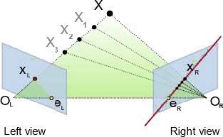
The formation of a digital image is the projection of a 3D scene onto a 2D plane, which results in the loss of depth information; the 3D location of a specific image point can only be constrained to be along a line of sight, and therefore you cannot determine its depth along the line from a single image. However, if two images of the same scene are available, then the position of an object in 3D can be found as the intersection of the two projection rays: one from each photograph using a process called triangulation.
The key for triangulation is the relationship between multiple views which convey the information that corresponding sets of points must contain some structure and that this structure is related to the poses and the calibration of the camera. This geometry is conceptually illustrated in Figure 2.8. Therefore, if common points can be identified in overlapping images, these can be used to both solve for the pose of the camera (position and orientation), and for the 3D coordinates of these common points on the ground. This process is commonly referred to as photogrammetry. More details on the photogrammetric process can be found in [Luhmann et al. 2013, Wolf et al. 2014].
From photogrammetry to structure from motion.
Photogrammetric processes to determine 3D coordinates from overlapping images have been around since the first days of aerial photography from balloons. However, the use of photography for rendering dense 3D models has only recently become commonplace. There are two principal reasons for this: (a) computing power for high resolution mapping and modeling has only recently been available, and (b) automated image matching techniques were not available. With recent increases in computing power, the first limitation has been removed. The second limitation has been overcome by a series of automated algorithms that automatically detect unique features in an image and then match these unique features between sets of images, providing the automated correspondence required to determine both camera pose and 3D location of points in the images.
There are a variety of common image point matching algorithms, with the most widely used being SIFT (Scale Invariant Feature Transform). The automated matching of common features between sets of images using algorithms such as SIFT enables the generation of dense 3D models from overlapping images. There are now a number of open source and commercial software packages capable of performing structure from motion calculations. Density of the final point clouds are normally at or near the pixel size of the input imagery (i.e., for 1 meter pixel photography, the resultant point cloud would have approximately 1 meter point spacing). The processing of using automated image matching software to generate dense point clouds is most accurately referred to as structure from motion with multi-view stereo (SFM- MVS), although the entire process is sometime referred to as SFM.
Processing software packages.
With the recent explosion in the use of SFM-MVS techniques for deriving 3D models, there has also been the emergence of many software packages, both open source and commercial for the creation of 3D models for overlapping photographs. While not an exhaustive list of possibilities, the products below are most commonly used in Earth surface mapping applications.
Open Source Options.
- AMES Stereo Pipeline: https://ti.arc.nasa.gov/tech/asr/groups/intelligent-robotics/ngt/stereo/
- MicMac: https://micmac.ensg.eu
- OpenSfM: https://www.opensfm.org/
Commercial Products.
- Agisoft Photoscan: https://www.agisoft.com/
- Pix4D : https://www.pix4d.com
- Bentley ContextCapture: https://www.bentley.com/en/products/brands/contextcapture
The majority of first time Unmanned Aircraft Systems (commonly known as “UAS”) users normally will choose either Agisoft Photoscan or Pix4D for their initial testing and model generation.
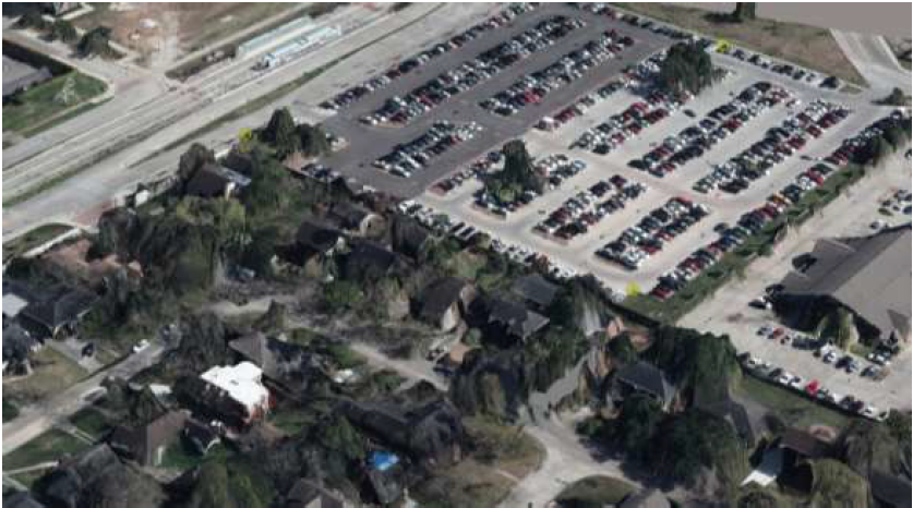
An example point cloud, created using SFM-MVS on high resolution (10 cm pixel resolution) airborne image is given below in Figure 2.9. The figure shows a colorized point cloud in an oblique view. Note that the SFM process does very well modeling hard surfaces (e.g., pavement, rooftops), but does not perform as well in vegetation. The SFM process requires that at least two photographs image the exact same spot, but from different viewpoints. This is difficult in vegetation, and as a result, SFM provides very little mapping under a tree canopy; in areas of vegetation, the SFM 3D model primarily only maps the top of the tree canopy or vegetation. This is an important consideration for vegetated areas, because a majority of applications are more interested in a terrain model.
Point Cloud Processing Software.
The following is not meant to be an exhaustive list, but rather a sampling of some of the more commonly used packages within the academic, DoD, and commercial sectors.
Open Source Options.
- The Point Data Abstraction Library (PDAL), which is more commonly referred to by its acronym PDAL. PDAL is a software library that has been open source since its inception in 2011, and provides a standalone application for point cloud processing, a C++ library for development of new point cloud applications, and bindings to both MATLAB and Python. Central to PDAL are the concepts of stages, which implement core capabilities for reading, writing, and filtering point cloud data and pipelines, which are end-to-end workflows for transforming point clouds. PDAL can be used to automate tasks such as generating a digital terrain model, removing noise, classifying data, and reprojecting between coordinate systems
(www.pdal.io). - CloudCompare: CloudCompare is a 3D point cloud (and triangular mesh) processing and visualization software. It was originally designed for performing comparisons between two dense point clouds. It has also been extended to include many algorithms for manipulating point clouds including registration, resampling, statistical computations, and segmentation
(www.danielgm.net/cc/).
Commercial Options.
All of the products listed below provide software for managing and processing large volumes of LiDAR point clouds, including classification, visualization, and final product (e.g., DTM and DEM) generation.
- QT Modeler: A stand-alone software package with wide use across the DoD
(www.appliedimagery.com). - Terrascan: A processing and production software package utilized by most commercial firms offering ALS and MLS services. Software runs as a plug-in to Bentley Microstation
(www.terrasolid.com). - LP360: This runs as a plug-in to ArcGIS and is utilized mainly by engineering and design firms using airborne laser scanning (www.geocue.com/products/lp-360).
Chapter 3: Processing Geospatial Data
Introduction.
Image processing in the context of remote sensing refers to the management of digital images, usually satellite or digital aerial photographs. Image processing includes the display, analysis, and manipulation of digital image computer files. The derived product is typically an enhanced image or a map with accompanying statistics and metadata. An image analyst relies on knowledge in the physical and natural sciences for aerial view interpretation combined with the knowledge of the nature of the digital data. This chapter will explore the basic methods employed in image processing. Many of these processes rely on concepts included in the fields of geography, physical sciences, and analytical statistics.
Image Processing Software.
Imaging software facilitates the processing of digital images and allows for the manipulation of vast amounts of data. There are numerous software programs available for image processing and image correction (atmospheric and geometric corrections). USACE has an enterprise license for ESRI’s ArcGIS which includes some image processing capabilities. Common commercial processing software suites include ERDAS Imagine, ENVI, QT Modeler (for point cloud data), and GAMMA (for RADAR data). Open source alternatives include QGIS, Geospatial Data Abstraction Library, PDAL, and others.
The various programs available have many similar processing functions. There may be minor differences in the program interface, terminology, metadata files (see below), and types of files it can read (indicated by the file extension). There can be a broad range in cost. Be aware of the hardware requirements and limitations needed for running such programs. An online search for remote sensing software is recommended to acquire pertinent information concerning the individual programs.
Metadata.
Metadata is ancillary information about the characteristics of the data or “data about data.” It describes important elements concerning the acquisition of the data as well as any post- processing that may have been performed. Metadata comes in many forms, but for image data, metadata is typically found in an accompanying file (often a text file). Metadata files document the source (e.g., sensor platform, sensor, vendor), date and time, projection, precision, accuracy, resolution, radiometric data, and geometric data. It is the responsibility of the vendor and the user to document any changes that have been applied to the data. Without this information, the data could be rendered useless.
Depending on the information needed for a project, the metadata can be an invaluable source of information about the scene. For example, if a project centers on change detection, it will be critical to know the dates and times that the imagery was collected. Numerous agencies have worked toward standardizing the documentation of metadata in an effort to simplify the process for both vendors and users. The USACE follows the Federal Geographic Data Committee standards for metadata (https://www.fgdc.gov/metadata/csdgm/). The importance of metadata cannot be overemphasized.
Viewing the Image.
Image files are typically displayed as either a gray scale or a color composite. When loading a gray scale image, the user must choose one band (data set) for display. Color composites allow three bands of wavelengths to be displayed at one time. Depending on the software, users may be able to set a default band/color composite or designate the band/color combination during image loading.
Band/Color Composite.
Color composites allow you to display three data sets (often three bands in an image) in a single view by mapping the data in each band to one of three colors displayed by your monitor/projector. The most common color composite is “true color” (Figure 3.1a). A true color composite mimics what your eyes would see, so bands corresponding to the wavelengths of red (~700 nm), green (~550 nm), and blue (~400 nm) are shown as red, green, and blue by your display.
Many sensors have more than three bands and have bands that capture data from areas of the electromagnetic spectrum outside what our eyes can see. “False color” composites allow us to have visual combinations of these bands. A common false color composite is Red Green Blue (RGB) = NIR/R/G, also called a “near-IR composite,” like a near IR photograph (Figure 3.1b).
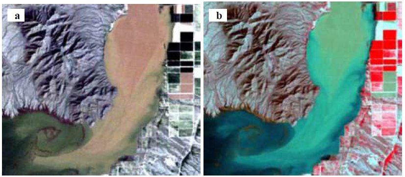
Figure 3.1b is a false color composite, where RGB = Near IR, Red, Green. This is often called a
‘near IR composite’ and highlights healthy vegetation (in red).
In this combination, a near-IR band (often ~800-850 nm) is shown as red, red (~700 nm) is shown as green, and green (~550 nm) is shown as blue. It is important for interpretation purposes to know what band combinations you are displaying. For example, in this configuration, healthy vegetation appears bright red. This is because high chlorophyll content makes vegetation highly reflective of near-IR light, orders of magnitude more than for either red, green, or blue. In a true color composite, the vegetation would appear green because vegetation reflects relatively more green light than red or blue. Color composites are an initial way of exploring some of the concepts regarding material spectra discussed in Chapter 1.
Displaying Imagery: Ellipsoids, Datums, and Projections.
A map projection is the method by which data about Earth’s surface (a lumpy, oblate spheroid) is displayed in two dimensions (on a map or your screen, for example). This first requires a description or reference system for Earth, which includes an ellipsoid and a datum.
An ellipsoid is a simple geometric shape that approximates the shape of the planet, defined by its major and minor axes. If Earth had uniform density and a smooth surface, an ellipsoid would provide all the information you’d need to define a two-dimensional reference system. This ellipsoid is the basis of a coordinate reference system; however, because we generally discuss elevation in “height above sea level” rather than “height above the ellipsoid,” and sea level is variable across the planet because of heterogeneous mass distribution, we need to establish a reference sea level.
Datums describe the lumpiness or the distribution of the Earth’s mass, and therefore provide a crucial vertical component to the (horizontal) reference system. It should be noted that datums often do not describe surface topography, rather distribution of mass at a very large scale, and while they are updated as new gravitational surveys are performed, this is relatively rare (semi-decadal to decadal).
A local datum may include topography depending on the way it was generated and the size of the area surveyed. At this point, the spatial relationship of all the points of the globe is defined and could be described by a geographic coordinate system (latitude relative to the equator, longitude relative to the prime meridian), but to display it on a screen, we need to project it. For a more complete discussion of ellipsoids, datums, and USACE standards regarding them, please consult EM 110-2-6056: Standards and Procedures for Referencing Project Elevation Grades to Nationwide Vertical Datums.
Map projections describe how a three-dimensional surface is displayed in two dimensions. For example, one could make a map of the continental U.S. using a globe and a sheet of paper. First, place the sheet of paper over the center of the U.S. It touches the globe at only one point, the intersection of a plane and a sphere. This point can represent the origin of a coordinate system: 0 meters East, 0 meters North. Next, draw an imaginary line between every point on the globe (in this case, probably just the half closest to the paper), and the sheet of paper, transferring the data from that spot on the globe to the paper.
Now the three-dimensional data is represented on a two-dimensional surface. The data has been projected to a planar projection, as the “developable shape” (the sheet of paper) is a plane. While moving away from the center point, the distance traveled on the globe is farther than the distance travelled on the paper. This results in distortion of the projected image, relative to the globe.
Map distortion is a necessary inconvenience of projecting data. Different projections utilize different developable shapes (such as cones, cylinders), different origin and reference structures (points, parallels, meridians), different units (degrees, meters, radians), and different target areas (global, continental U.S., polar) to minimize distortion and provide the most appropriate display for a given application. Projections may preserve distance, area, angle, or shape, but cannot perfectly preserve all elements of a surface.
Transformations are the mathematical methods used to convert the geopositional data of one coordinate/projection system to another. Conceptually, this is done by first reversing the previous exercise—converting the map coordinates back to the three-dimensional (or geographic) coordinates—then converting to a new projected system. Most remote sensing software packages include reference systems and transformations (such as those found at http://spatialreference.org/) and can transform data on-the-fly, allowing it to be displayed coincidentally with data that may use a different coordinate system. All software packages have the ability to reproject data to a desired reference system and projection.
Registration and Rectification.
Registration or georegistration is the process of attributing geospatial information to a raw image. This is mostly commonly done using positional data collected at the sensor, sometimes termed “ephemeris data,” using IMU. This information allows the image to be projected and positioned or georegistered. Georegistration can also be accomplished using the image-to-image or image-to-landmark method described below; however, most public and commercial remotely sensed data is provided already georegistered.
Rectification is the process by which an image is warped to more accurately represent known surface characteristics such as elevation or landmarks. Rectification is most commonly used to correct for the effects of relief displacement caused by topography. Relief displacement is the visual perception that taller features (or features with more relief above an arbitrary plane) lean away from the sensor. In imagery this manifests in both subtle and obvious ways. Trees and buildings appear to lean away from the sensor; this distortion is not corrected for, as the goal of rectification is to correctly represent the image location of the ground surface.
Topographic relief also causes relief displacement and is targeted by rectification. Because rectification involves warping an image, essentially stretching pixels or groups of pixels out to fill variable amounts of ground space, it is common to resample the output such that each pixel is square and all pixels are the same size. This ultimately produces an image where each pixel attempts to represent an equal parcel of the ground surface and display data values as if it were viewed from nadir. This end result is called an ortho-image (or an ortho-photo) and the full process is called orthorectification.
Image-to-Image Rectification. Remote sensing software packages allow the user to rectify (or register) an image by correlating features in the image to features in another image or map using Ground Control Points (GCPs). This method uses a (variable degree) polynomial model to warp the image such that the user-defined points most closely match in the source and reference image. The success of this method relies on the user choosing appropriate and accurate GCPs. Features used as GCPs often include manmade, ground-level objects with little to no movement over time, such as the foundations of buildings, surveyor landmarks, and intersections of roads. Natural features may also be used, but temporal variability between a source and reference scene can result in error in your rectification.
After choosing control points, the user can select what type and what order polynomial is used to warp the image. The appropriate choice varies by application. In general, higher order polynomials can more easily adapt to variable topography but require both more GCPs to use also produce more edge-effects and distortion in areas where GCP density is low. Finding a balance for your application and area of interest is at the user’s discretion. Image-to- image rectification utilities will provide tables that show the source coordinate for each of your GCPs, the reference coordinate, and the output (or warped) coordinate. The output coordinate and the reference coordinate differ because the polynomial model cannot perfectly replicate your reference data (unless it had either infinite points or infinite orders).
These tables generally include the Root Mean Square Error (RMSE) or the average difference between the reference points and the warped output. Importantly, this is not an expression of the accuracy of your rectification—it is a description of how close the model you chose was able to fit itself to your inputs, using the number of points you provided it with. Large RMSE may result from poorly chosen GCPs, lack of GCP density, inappropriate polynomial or order selected. Refining your rectification so that it is both precise and accurate is an iterative process.
Automatic (Rapid Positioning Coefficient-Driven) Rectification.
- Rapid Polynomial Coefficients (RPCs) are a series of equations that relate image space (or sensor space) and ground space. They are derived from ephemeris data and provide per-pixel positional aids for the appropriate software. RPCs are delivered standard as part of DigitalGlobe’s NITF formats and are more commonly being included with other vendor products. Some software suites (like ENVI) can generate RPCs for select satellite/sensor systems.
- RPCs allow the user to sensitively and accurately orthorectify an image using a DEM. The accuracy of this process is largely dependent on the accuracy and spatial resolution of the DEM used (with highest accuracies occurring when the resolution of the DEM is the same or higher than that of the image). This functionality is notably included (with specific support for NITF imagery) in ArcGIS (in versions after 10.1).
Resampling.
The concept of resampling raster data is important to many of the processes, and in some cases, the individual steps involved in projecting, reprojecting, and rectifying imagery. Resampling is the process of changing a pixel’s orientation, size, location, or value.
Pixel orientation.
When an image is initially collected, its pixel orientation is usually in line with the direction the sensor was moving. This rarely (if ever) aligns with the standard projections and grids that most users utilize. These data resampled to align with the target coordinate system and grid.
Size.
Sometimes you need to change the size of the pixels in an image, this could be to compare it to a different raster or might just be part of a reprojection. For example, a geographic projection (Figure 3.2) might have a pixel that is 1° latitude by 1° longitude. These data could be plotted as square pixels, but because the length of a degree of longitude changes with latitude, the areal extent of a pixel is inherently variable when compared to the ground surface. If converted to an equal-area projection, or a projection where each pixel represents the same ground area, one of our 1° would end up being represented by a variable number of equal- area pixels after it was resampled.
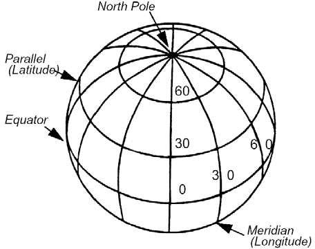
Location.
In the example of orthorectification above, sometimes image pixels are not initially represented correctly in space. Resampling is part of the process of moving those pixels to their new locations; this functionality is closely tied to (sometimes) changing pixel values.
Value.
When moving a pixel or changing its size or orientation, you inherently change the ground surface that it is representing. In some cases, a pixel in your output may overlap several pixels in your input, and different resampling methods allow you to incorporate that information (or ignore it) in the process to produce the most useful and accurate product.
There are a variety of algorithms available for resampling, but there are three common ones that will be covered here (understanding these will help contextualize others you may encounter): nearest neighbor, bilinear interpolation, and cubic convolution. These each dictate how values in your input are mapped to your output.
Nearest neighbor. Nearest neighbor resampling assigns pixel values in your output based on the nearest pixel value in your input (calculated from pixel center to pixel center in Euclidian distance). This method is the fastest and does not change any values (though it may exclude values) that were present in your source data. This is recommended for thematic data sets (where numeric values represent unique classes—for example, land cover type).
Bilinear interpolation. Bilinear interpolation computes a spatial weighted averaging of input pixels around the location (usually the nearest four) of the output pixel to determine its value. This is relatively fast and produces an approximation of contributing pixel values in your output product. The average is weighted by Euclidian distance between each of the four inputs and the single output. The output value will always be within the range of the input values.
Cubic convolution. Cubic convolution considers a collection of pixels around your output location (an N by N square), fits a polynomial function to those points, and outputs the value of that function at the location of your output as the value of the output. This can produce values outside the range of inputs.
Image Enhancement.
An advantage of remote sensing data lies in the ability to visually evaluate the data for overall interpretation. A useful visual interpretation may require manipulating how the image data is displayed or what parts of an image are displayed. There are many methods that can be used for image enhancement; we will briefly cover contrast stretching, band arithmetic, spatial filtering, and principal components. The type of enhancement performed will depend on the appearance of the original scene and the goal of the interpretation.
Contrast Stretching.
Displaying and interpreting an image is dependent on the distinction between the source pixel value and the display value. The source value is the number stored in the image itself; it could be any many different formats (integer, float) and represent a number of different things (land cover, population, brightness). The display value is the integer value that your display uses to depict the source value; this is the color (or shade of grey) you actually see on your monitor. Let’s assume that your monitor displays in 8-bit, unsigned integer color, where 0 is black, 255 is white, and there are three color sources: red, green, and blue. Image data types and ranges vary by sensors, and most sensors are designed to capture a relatively wide range of brightness values (to avoid losing data).
Consider the example in Figure 3.3. The figure shows the histogram of an example image. A histogram is a representation of pixel value distribution within an image—it shows how often a pixel value (x-axis) occurs within the scene (y-axis). In this example, the source pixel values are stored in an 8-bit, unsigned format (0-255), similar to that of your display; however, the values of the pixels in the image only range between 84 and 153. This range only covers about a quarter of the total available values in your display, so it is likely that if you displayed this image using its source values as display values, it would be hard to distinguish between features in the scene, and it might look generally washed out and grey.
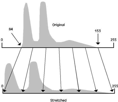
Figure 3.3 shows the outcome of a linear contrast stretch, reassigning the minimum image value (84) to the minimum display value (0), the maximum image value (153) to the maximum display value (255), and reassigning intermediate values to the range in between using a linear fit. An example of what these respective images might look like can be seen in Figure
3.4. Example histograms for a color display may be seen in Figure 3.5 and Figure 3.6; note that for color displays, the dynamic range or the range between the lowest and highest source values may be different in each band. Many different methods for contrast stretching exist, and most software packages allow you to manually design stretches if you so wish. A few common methods are described below:
Linear Stretch (described above). The linear stretch is sometimes referred to as a min-max stretch and involves remapping the lowest value in an image to the lowest value in the display, the highest value in an image to the highest value in the display, and distributing the intermediate values based on a linear fit. This works well for data that does not contain outliers (as outliers will dramatically reduce contrast because they, by definition, fall far from the mean value of the image). Example histograms and imagery shown in Figure 3.5 and Figure 3.6, respectively.
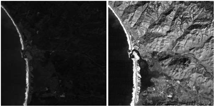
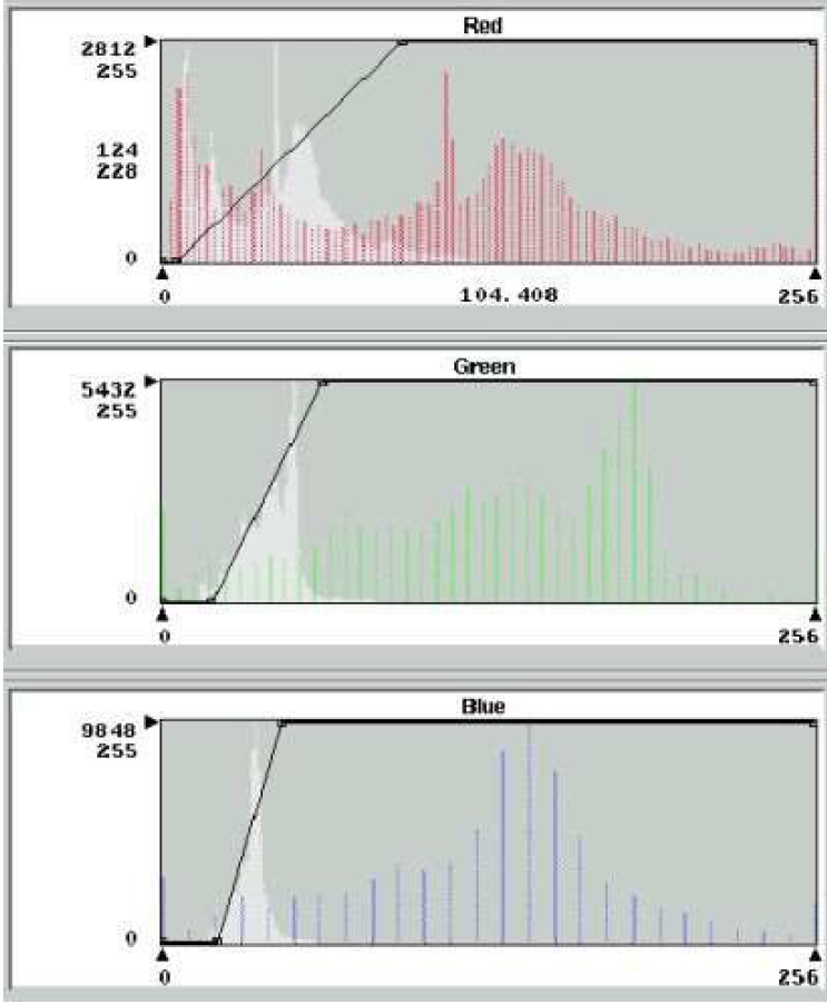
The top histogram (red) has a bimodal distribution. The middle (green) maintains a skewed distribution, while the last histogram (blue) reveals a normal distribution. The solid black line superimposed in each image indicates the maximum and minimum DN value that is stretched across the entire range.
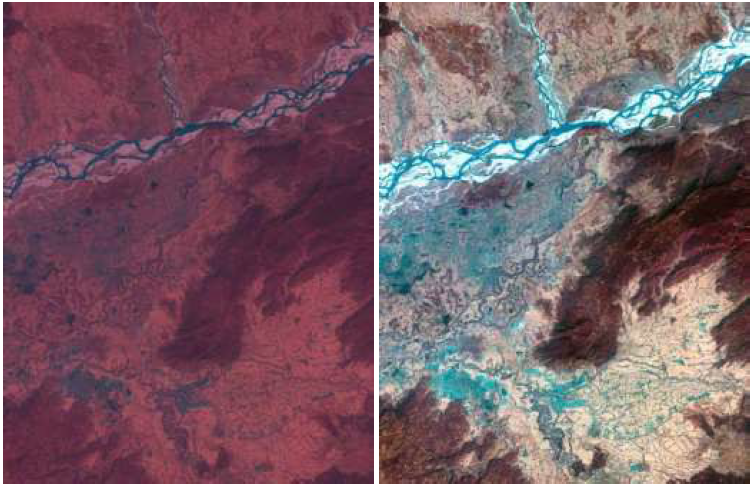
Histogram Equalization Stretch. Low contrast can still occur when values are spread across the entire range. The low contrast is a result of tight clustering of pixels in one area (Figure 3.7a). Because some pixel values span the intensity range, it is not possible to apply the contrast linear stretch. In Figure 3.7a, the high peak on the low intensity end of the histogram indicates that a narrow range of DNs is used by a large number of pixels. This explains why the image appears dark despite the span of values across the full 0–255 range.
Histogram equalization (Figure 3.7b) evenly distributes the pixel values over the entire intensity range (see steps below). The pixels in a scene are numerically arranged into 255 equal-sized groups and display brightness is assigned based on the ordinal number of the group. This method is generally used to improve contrast of very dark or very bright pixels in a scene, but often has limited effect on intermediate values (as it effectively flattens peaks in the histogram while emphasizing troughs).
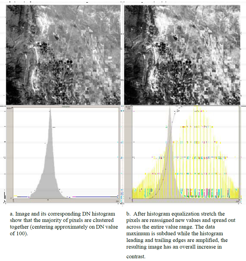
Logarithmic Stretch. Another type of enhancement stretch uses a logarithmic algorithm. This type of enhancement improves contrast among values on the lower end of the image distribution. Contrast among values on the upper end of the image distribution is generally sacrificed.
Manual Enhancement. Some software packages will allow users to define an arbitrary enhancement. This can be done graphically or numerically. Manually adjusting the enhancement allows the user to reduce the signal noise in addition to reducing the contrast in unimportant pixels. Note that the processes described above do not alter the spectral radiance of the pixel raw data. Instead, the output display of the radiance is modified by a computed algorithm to improve image quality.
Band Arithmetic.
While contrast stretching provides many valuable display options, sometimes fundamentally changing or combining data sets is necessary to enhance interpretation. Remote sensing software provides tools to do calculations on a per-pixel basis across an image, which has many important applications.
Band Ratio. Band ratio is a commonly used band arithmetic method in which values of one data set (band) are divided by those of another. Band ratios are used to highlight specific relationships between two spectral regions. For example, consider an image with a grassy field next to an artificial turf field. In a true color image, the fields appear to be similar. In a band ratio of IR and green bands of the same scene, the grassy field would appear very bright, while the artificial turf field would be grey or dark
(artificial turf is low reflectance in the IR).
Another application of band ratios is reducing the effects of shadows within an image. Shadows reduce the brightness of pixels equally across all bands because they are blocking the light source in the image. Because of this, shadowed and unshadowed pixels have the similar values in band ratio, while being very different individually. See Table 3.1 for an example.
Band ratios can also be used to highlight temporal change by computing a ratio between two images of the same band at two different times. In such an image, unchanged pixels would appear grey (within the dynamic range of the image), and pixels that experienced a change during that time period would be shown as darker greys or whiter greys, depending on the magnitude and nature of the change.
Table 3.1 Minimizing the effects of shadows using a band ratio

Normalized Difference Ratios. Normalized difference ratios highlight the difference between two spectral bands. To minimize artifacts caused by differencing images, the results are normalized using the original values. The generalized equation for a normalized difference ratio is ND = (DN2 – DN1)/(DN2 + DN1), where DN1 and DN2 are raster data sets or sensor bands. Common products utilizing normalized difference ratios are the Normalized Difference Vegetation Index (NDVI), where DN1 is a red band and DN2 is an IR band, and the Normalized Difference Snow Index (NDSI), where DN1 is a green band and DN2 is a SWIR band.
Spatial Filters.
It is occasionally advantageous to reduce the detail or exaggerate particular features in an image. This can be done by a convolution method creating an altered or “filtered” output image data file. Numerous spatial filters have been developed and can be automated within software programs. A user can also develop his or her own spatial filter to control the output data set. Presented below is a short introduction to the method of convolution and a few commonly used spatial filters.
Convolution is a mathematical operation used to change the spatial frequency of digital data in the image. It is used to suppress noise in the data or to exaggerate features of interest. The operation is performed with the use of a spatial kernel. A kernel is an array of DN values that form a matrix with odd numbered rows and columns (Table 3.2). The kernel values, or coefficients, are used to average each pixel relative to its neighbor across the image. The output data set will represent the averaging effect of the kernel coefficients. As a spatial filter, convolution can smooth or blur images, thereby reducing image noise. In feature detection, such as an edge enhancement, convolution works to exaggerate the spatial frequency in the image. Kernels can be reapplied to an image to further smooth or exaggerate spatial frequency.
Low pass filters apply a small gain to the input data (Table 3.2a). The resulting output data will decrease the spatial frequency by de-emphasizing relatively bright pixels. Two types of low pass filters are the simple mean and center-weighted mean methods (Table 3.2a and b). The resultant image will appear blurred. Alternatively, high pass frequency filters (Table 3.2c) increase image spatial frequency. These types of filters exaggerate edges without reducing image details (an advantage over the Laplacian filter discussed below).
The Laplacian filter detects discrete changes in spectral frequency and is used for highlighting edge features in images. This type of filter works well for delineating linear features, such as geologic strata or urban structures. The Laplacian is calculated by an edge enhancement kernel (Table 3.2d and e); the middle number in the matrix is much higher or lower than the adjacent coefficients. This type of kernel is sensitive to noise and the resulting output data will exaggerate the pixel noise.
Table 3.2 Variety in 9-Matix Kernel Filters Used in a Convolution Enhancement. Each graphic shows a kernel, an example of raw DN data array, and the resultant enhanced data array

A smoothing convolution filter can be applied to the image in advance to reduce the edge filter’s sensitivity to data noise. The Laplacian filter measures the changes in spectral frequency or pixel intensity. In areas of the image where the pixel intensity is constant, the filter assigns a DN value of 0. Where there are changes in intensity, the filter assigns a positive or negative value to designate an increase or decrease in the intensity change. The resulting image will appear black and white, with white pixels defining the areas of changes in intensity.
Scatter plots.
The correlation between bands can be visualized in scatter plots generated by the software. The scatter plots graph the DN value of one band relative to another (Figure 3.8). Bands that are highly correlated will produce plots with a linear relationship and little deviation from the line. Bands that are not well correlated will lack a linear relationship. Clustering of different spectral species in a scatter plot indicates that a particular band combination may be useful for interpretation or for use in a band ratio. The ability to easily delineate spectral species is called separability and is utilized both for manual interpretation and also for classification (discussed below).
The scatter plots map band 3 relative to bands 4 and 5 onto a feature space graph. The data points in the plot are color coded to display pixel population. The table provides the pixel count for five image features in bands 3, 4, and 5. A is agricultural land, B is deep (partially clear) water, C is sediment laden water, D is undeveloped land, E fallow fields.
Principal Components.
Principal component (PC) analysis is a technique that highlights spectral covariance within a scene by transforming the axes used to display the scene. The transformation is accomplished by rotating the horizontal axis of the scatter plot so that it is parallel to a least squares regression line that estimates the data. This transformed axis is known as PC1, or Principal Component 1.
A second axis, PC2, is drawn perpendicular to PC1, and its origin is placed at the center of the PC1 range (Figure 3.9). The DN values are then re-plotted on the newly transformed axes. Each principal component output can be viewed as its own greyscale raster or combined into a color composite. PC1 captures ~90% of the variance in a scene with each subsequent principal component display less (PC2 ~5%, PC3 ~3%, and so on; Figure 3.10). For a complete discussion of the technique, see Jensen (1996).
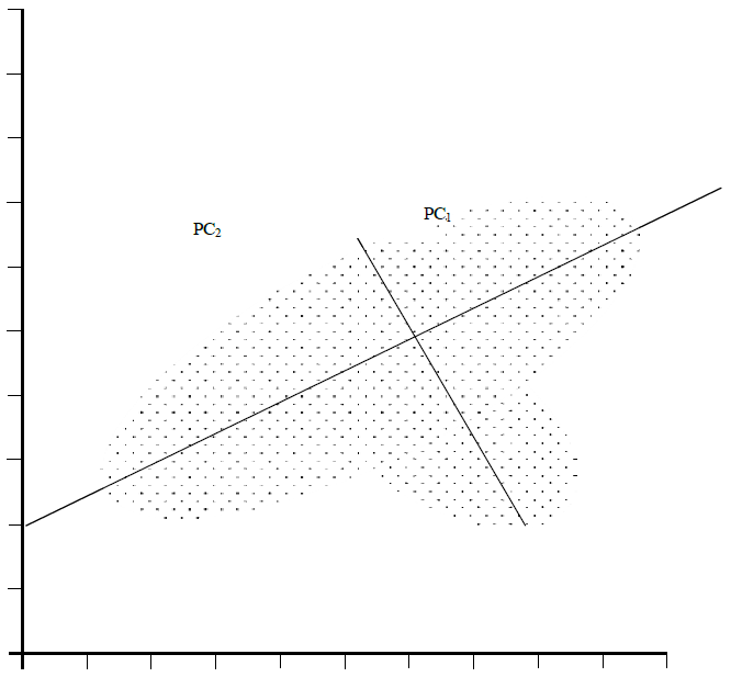
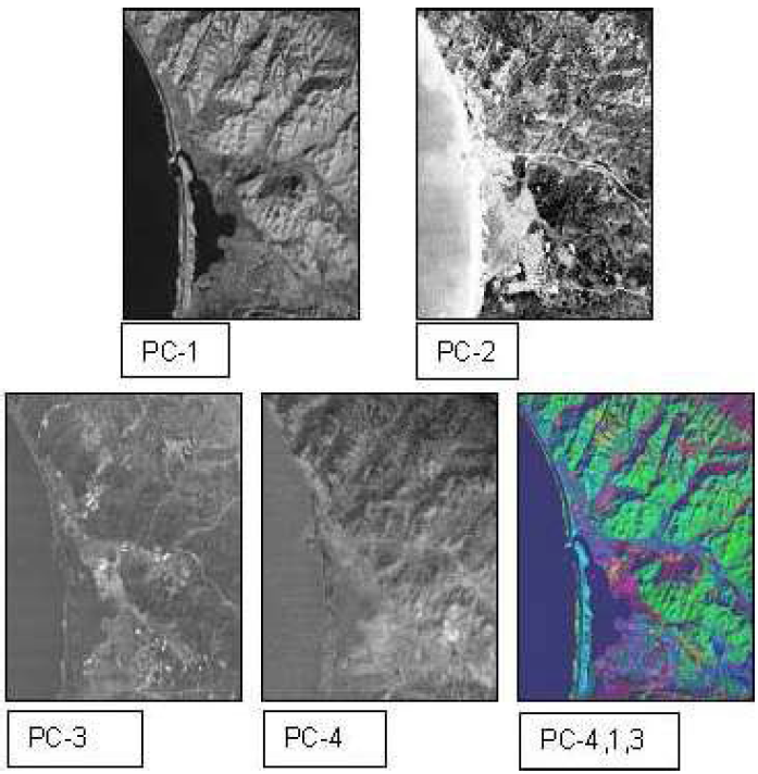
Image Classification.
Raw digital data can be sorted and categorized into thematic or classified maps. Thematic maps allow the analyst to simplify the image view by assigning pixels into classes with similar spectral values
(Figure 3.11). The process of categorizing pixels into broader groups is known as image classification. The advantage of classification is it allows for cost-effective mapping of the spatial distribution of similar objects (e.g., tree types in forest scenes); a subsequent statistical analysis can then follow.
Thematic maps are developed by two types of classifications, supervised and unsupervised. Both types of classification rely on two primary methods, training and classifying. Training is the designation of representative pixels that define the spectral signature of the object class. Training site or training class is the term given to a group of training pixels. Classifying procedures use the training class to classify the remaining pixels in the image.
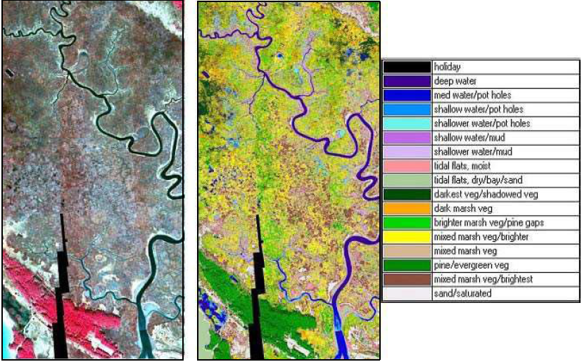
Supervised Classification. In a supervised classification, the user creates training data that the classification algorithm uses to segment the scene. Training data can be generated from spectral libraries or from visual interpretation of the scene itself. Clusters of pixels, representing thematic classes such as “Forest” or “Water,” are delineated by the user and then used as inputs to a classification algorithm. The most common classification algorithms are minimum-distance-to-means, parallelepiped, and maximum likelihood. An example thematic map can be seen in Figure 3.11 and its associated pixel counts in Figure 3.12.


- Minimum-Distance-to-Means. Minimum-distance-to-means is a simple computation that classifies pixels based on their distance from the mean of the training class. It is determined by plotting the pixel brightness and calculating its Euclidean distance to the unassigned pixel. Pixels are assigned to the training class for which it has a minimum distance. The user designates a minimum distance threshold for an acceptable distance; pixels with distance values above the designated threshold will be classified as unknown.
- Parallelepiped. In a parallelepiped computation, unassigned pixels are grouped into a class when their brightness values fall within a range of the training mean. An acceptable DN range is established by setting the maximum and minimum class range to plus and minus the standard deviation from the training mean. The pixel brightness value simply needs to fall within the class range, and is not based on its Euclidean distance. It is possible for a pixel to have a brightness value close to a class and not fall within its acceptable range. Likewise, a pixel may be far from a class mean, but fall within the range and therefore be grouped with that class. This type of classification can create training site overlap, causing some pixels to be misclassified.
- Maximum Likelihood. Maximum likelihood classifiers calculate probability surfaces based on covariance around class means. A probability threshold is established for designating classes, and for any given pixel, if it falls within the probability threshold for a class, it is assigned to that class. This method is functionally similar to the minimum-distance-to-mean classifier, but the distance to probability relationship is not necessarily linear. These methods offer different levels of customization in standard software and produce somewhat different results. Choosing a classification algorithm will vary by application. Example outputs of the three classification algorithms can be seen in Figure 3.13.
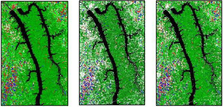
Unsupervised Classification. Unsupervised classification utilizes algorithms to identify similar pixels and automatically separate them into thematic classes. As opposed to supervised classification, where much of the user input occurs at the beginning of the process, most of the effort required in unsupervised classification involves interpreting the results after the process has been completed. In most software packages, the user designates: (1) the number of classes, (2) the maximum number of iterations or refinements to the spectral classes that the algorithm will perform, (3) the maximum number of times a pixel can be moved from one cluster to another with each iteration, (4) the minimum distance from the mean, and (5) the maximum standard deviation allowable. Default values for these parameters often exist, but producing a favorable output might require some trial and error.
A variety of clustering algorithms exist, but they all operate in a similar way; in the beginning of the process, each pixel in an image is randomly assigned to an output class (based on the user-specified number of classes). The distance (in n-dimensional, spectral space, where n is the number of bands) from each pixel to the center of its designated class is calculated (similar to minimum-distance-to-means). Once the mean values of each class are established, pixels are reclassified based on the class they are closest to (again based on user input thresholds). This process is repeated (up to the maximum number of iterations) or until a particular pixel has stopping changing classes (or changed too many times—this could occur if a pixel lies near the boundary of two spectrally similar classes).
Once the number of iterations is exceeded or no more pixels are changing classes, the algorithm stops. At this point, the user must determine what thematic data (such as land cover) each of the generated classes represents. The outputs of the algorithm are referred to as spectral classes. Depending on the intensity and quality of the classification, as well as the intended application, a user may want to merge multiple spectral classes into a single information class for display in a final product. Similarly, if a spectral class includes multiple information classes (as determined by the user) the algorithm can be re-run on an individual class or an individual area of interest to improve the classification. Classification is an iterative process, and the “right answer” is often highly dependent on the user and the application.
Assessing Error. If a reference map or field data exists with which to assess the accuracy of a classification, said accuracy is often described by an error matrix (Table 3.3). The matrix establishes the level of errors due to omission (exclusion error), commission (inclusion error), and can tabulate an overall total accuracy. The error matrix lists the number of pixels found within a given class. The rows list the pixels classified by the image software. The columns list the number of pixels in the reference data (or reported from field data). Omission error calculates the probability of a pixel being accurately classified; it is a comparison to a reference. Commission determines the probability that a pixel represents the class for which it has been assigned. The total accuracy is measured by calculating the proportion correctly classified pixels relative to the total tested number of pixels (Total = total correct/total tested).
Table 3.3 Omission and Commission Accuracy Assessment Matrix (Jensen 1996)

Image Mosaics, Image Subsets, and Multiple Image Analysis.
Image Mosaics.
It is not uncommon for a study area to include areas beyond the range of an individual scene. In such a case, it will be necessary to collect adjacent scenes and mosaic or piece them together. It is preferable to choose scenes with data collected during the same season or general timeframe and under similar weather conditions. Images can only be properly pieced together if their data are registered in the same projection and datum. It will be important to assess the registration of all images before attaching the scenes together. If any of the images are misregistered, this will lead to gaps in the image or it will create pixel overlay. (Figure 3.14)
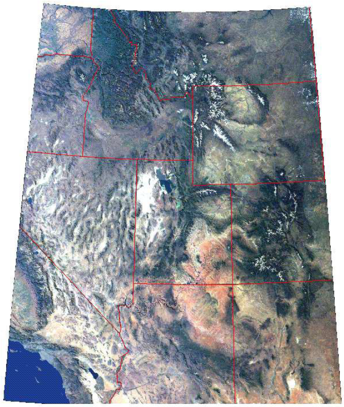
Image Mosaic and Image Subset.
The mosaic process is a common feature in image processing programs. It is best to perform image enhancements prior to piecing separate scenes together. Once the images are pieced together, the resulting image may be large and include areas outside the study region. It is good practice to take a subset of this larger scene to reduce the size of the image file. This will make subsequent image processing faster.
To do this, use the clip or subset function in a software program. The clip function will need to know the corner coordinates of the subset (usually the upper left and lower right). Some software may require this procedure to be repeated for each individual band of data. The subset should be named and saved as a separate file or files. Note: An image subset may also be required if the margins of a newly registered scene are skewed or if the study only requires a small portion of one scene. Reduction of the spatial dimensions of a scene reduces the image file size, simplifies image classification, and prepares the image for map production.
Multiple-Image Temporal Analysis.
It is possible to combine bands from different images or data sets. This allows a user to perform a change detection analysis. The process of “layering” multi-temporal data involves loading a composite of bands from different images of the same scene. For example, a study assessing urban development in a forested area would benefit from examining a band combination that included Band 3 data in the red plane, and Band 3 data of a later image in the green plane. If the spectral signature of the scene has changed and is detectable within the resolution of the data, then changes in the scene will be highlighted.
This image can then be classified and the areas of change can be statistically assessed. To perform this task accurately, it is important that both images are registered properly. Misregistration will lead to an offset in the image, which leaves brightly colored lines of pixels. Be sure to choose images whose data were collected under similar conditions, such as the same season, time of day, and prevailing weather (namely, minimum cloud cover).
Digital Elevation Models (DEMs)
A DEM is a digital display of cartographic elements, particularly topographic features (Figure 3.15). DEMs utilize two primary types of data, DTMs and Digital Surface Models (DSMs). A DTM represents elevation points of the ground, while a DSM is the elevation of points at the surface, which includes the top of buildings and trees, in addition to terrain. A DEM incorporates elevation data and projects it relative to a coordinate reference point. (See the USGS National Map website at http://nationalmap.gov/index.html for more information on DEM, DTM, and DSMs.)
Advanced Topics in Image Processing.
Remote sensing software facilitates a number of advanced image processing methods. These advanced methods include the processing of hyperspectral data, thermal data, and radar data.
Hyperspectral Data.
Hyperspectral image processing techniques manage narrow, continuous bands of spectral data. Many hyperspectral systems maintain over 200 bands of spectral data. The narrow bands, also known as channels, provide a high level of detail and resolution. This high resolution facilitates the identification of specific objects, thereby improving classification (Figure 3.16). The advantage of hyperspectral imaging lies in its ability to distinguish individual objects that would be otherwise grouped in broadband multi-spectra imagery. Narrow bands are particularly useful for mapping resources such as crop and mineral types. The narrow, nearly continuous bands create large data sets, which require advance software and hardware to store and manipulate the data.
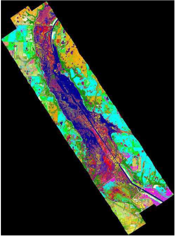
(Classifications of 28 vegetation communities are based on a supervised classification)
Thermal Data.
Thermal image processing techniques are used to image objects by the analysis of their emitted energy (Figure 3.17). The thermal band wavelength ranges are primarily 8 to 14 µm and 3 to 5 µm. The analysis of thermal data is typically used in projects that evaluate surface temperatures, such as oceans and ice sheets, volcano studies, and the emission of heat from manmade objects such as pipelines or buildings.
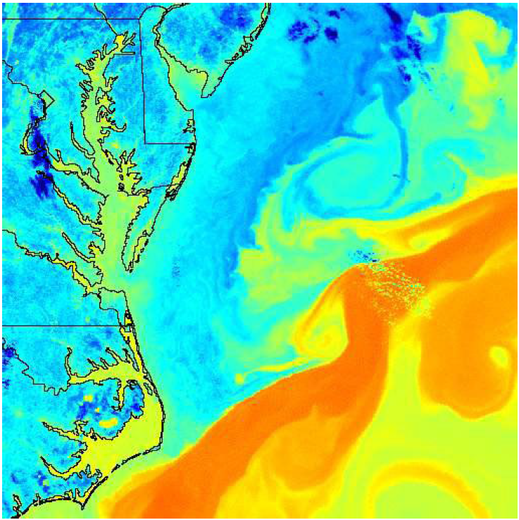
Radar.
Radar (radio detection and ranging) systems are able to penetrate cloud cover in certain wavelengths. This technology is useful for imaging day or night surface features during periods of intense cloud cover, such as storms and smoke from fire, sand, or dust storms (Figure 3.18).